Rowan is an elevated, intimate restaurant in Southeast Portland, serving innovative, contemporary cuisine made with locally sourced Pacific Northwest ingredients. As Rowan prepared to launch dinner service, the restaurant needed a brand to match its evolution. Long known as Cafe Rowan for its coffee and brunch, it was ready to be seen as a true dinner destination. The rebrand began with a simple but deliberate move: dropping “Cafe” from the name, shifting perception from casual daytime spot to sophisticated evening experience, while keeping the warmth that made the neighborhood fall for it in the first place.
Imperfect
Minimal
Sophisticated
Playful
Modern
Natural
Brand Design
Illustration
Menu Design
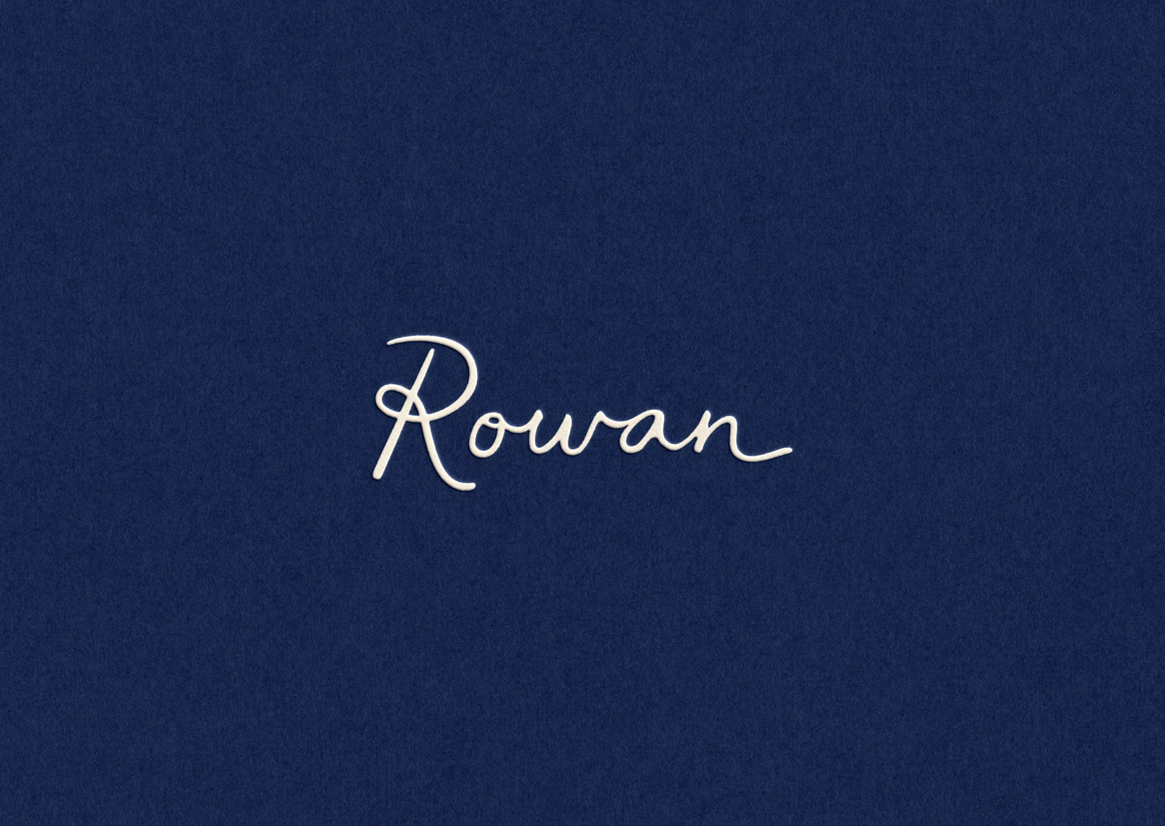


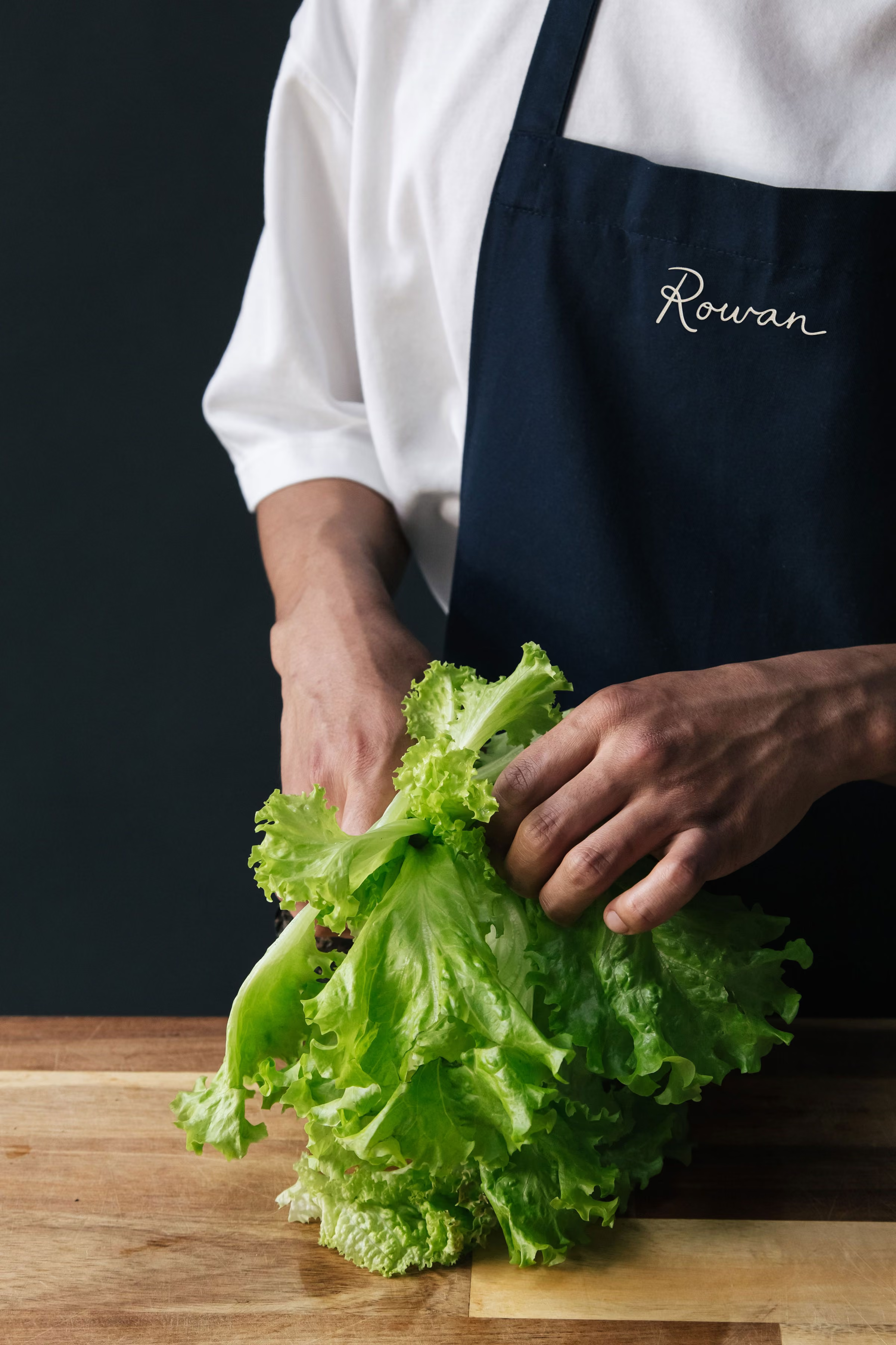


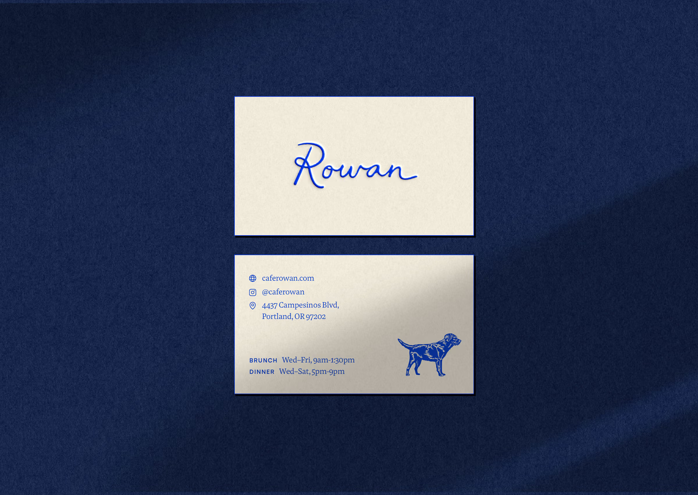
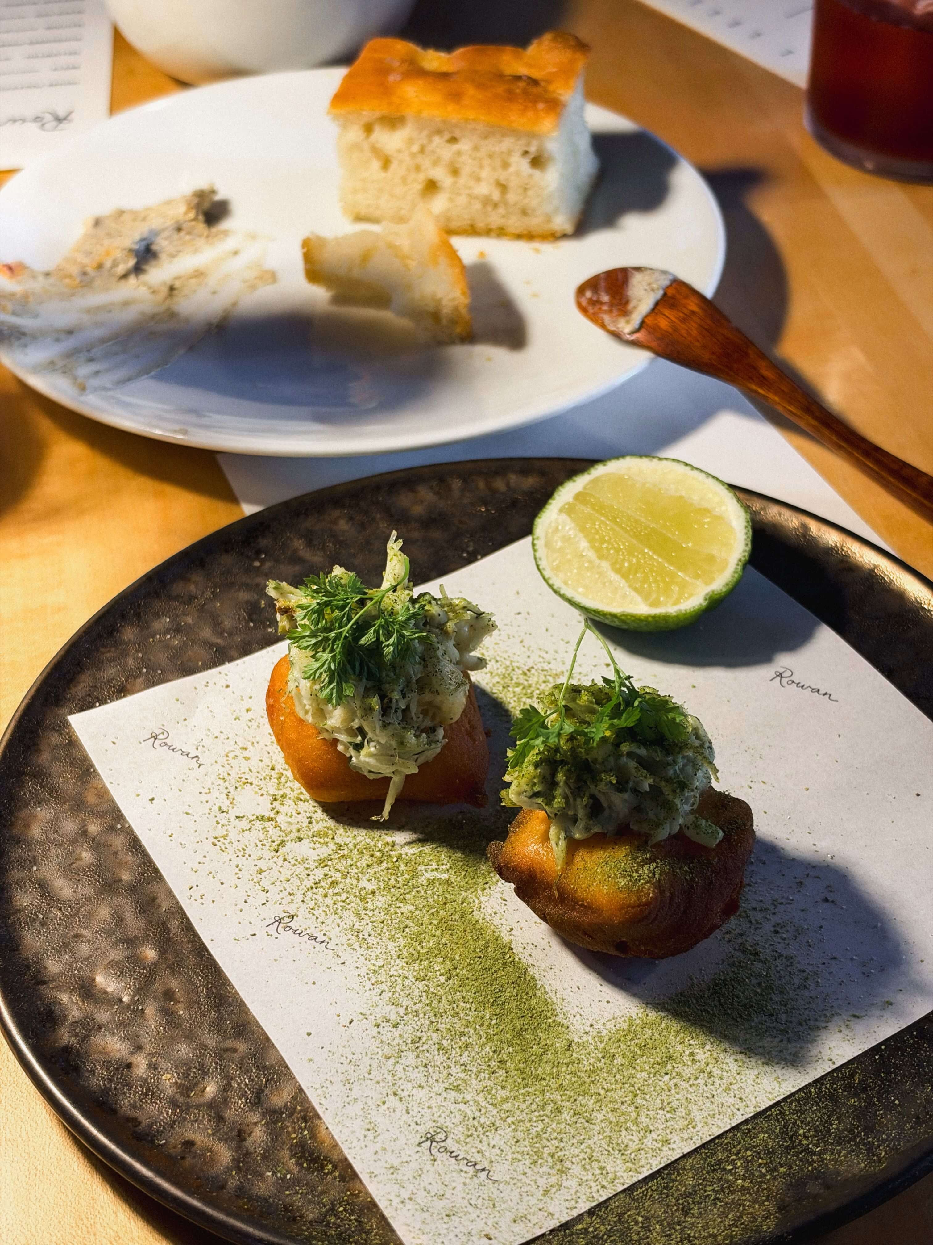
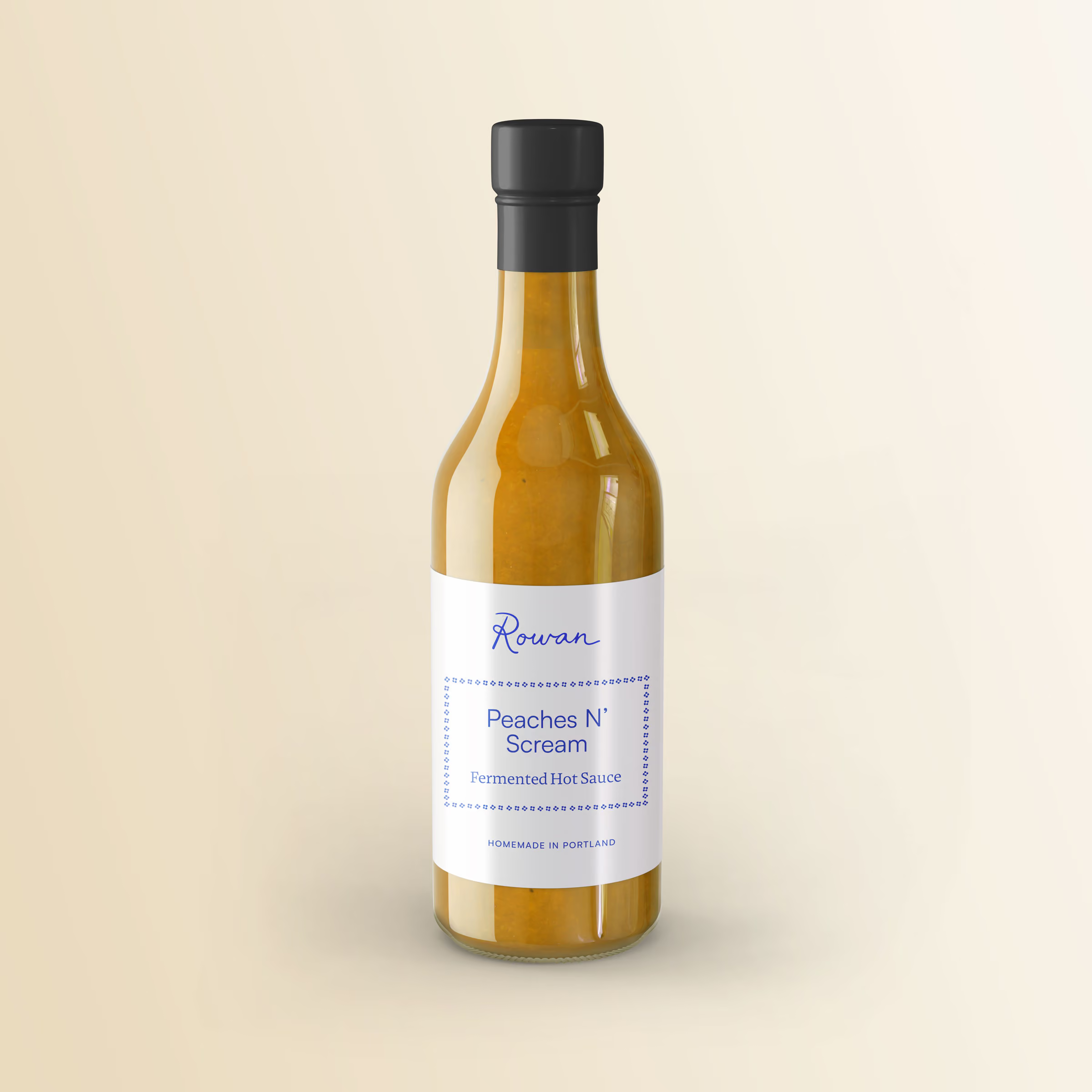

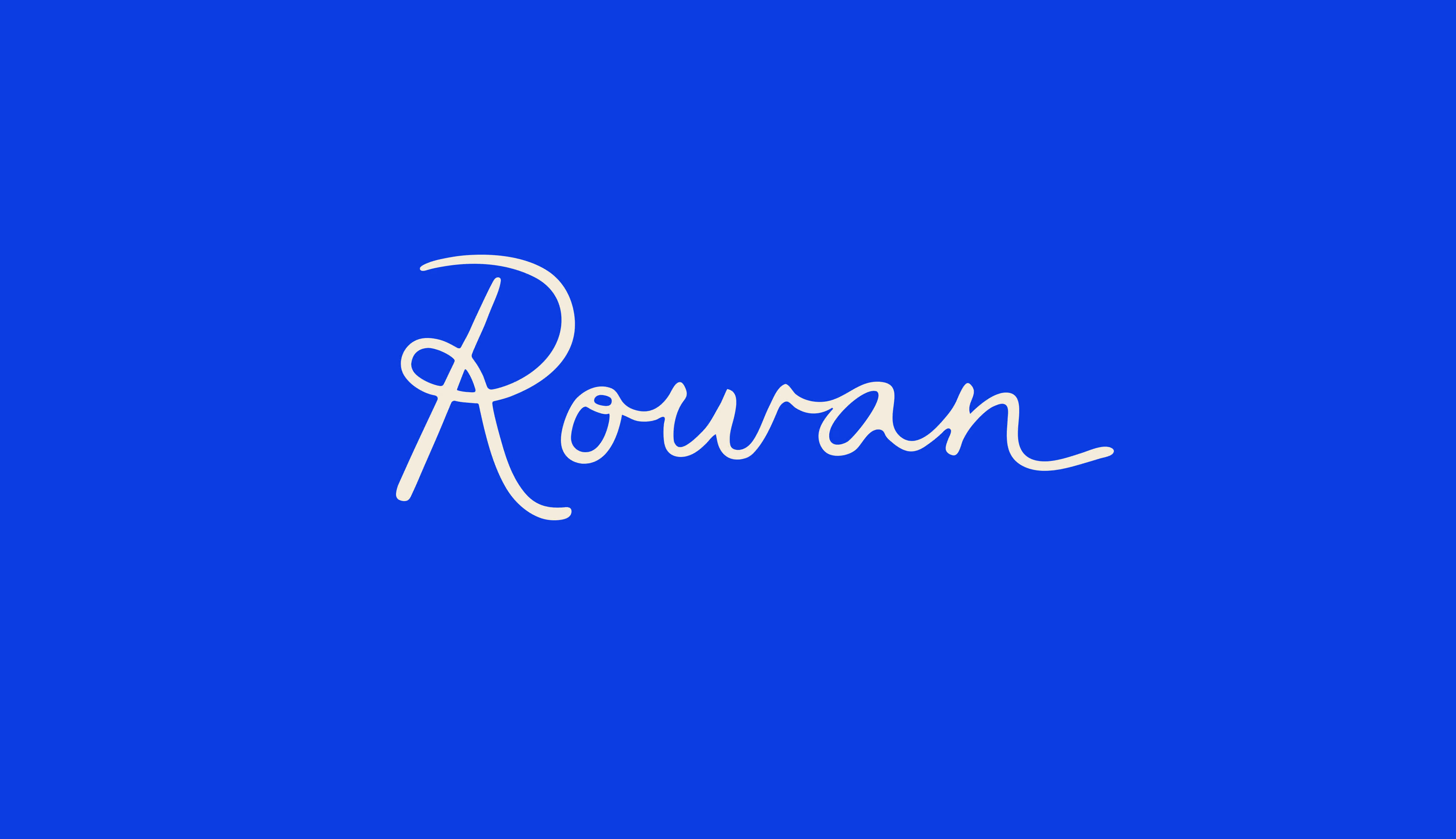
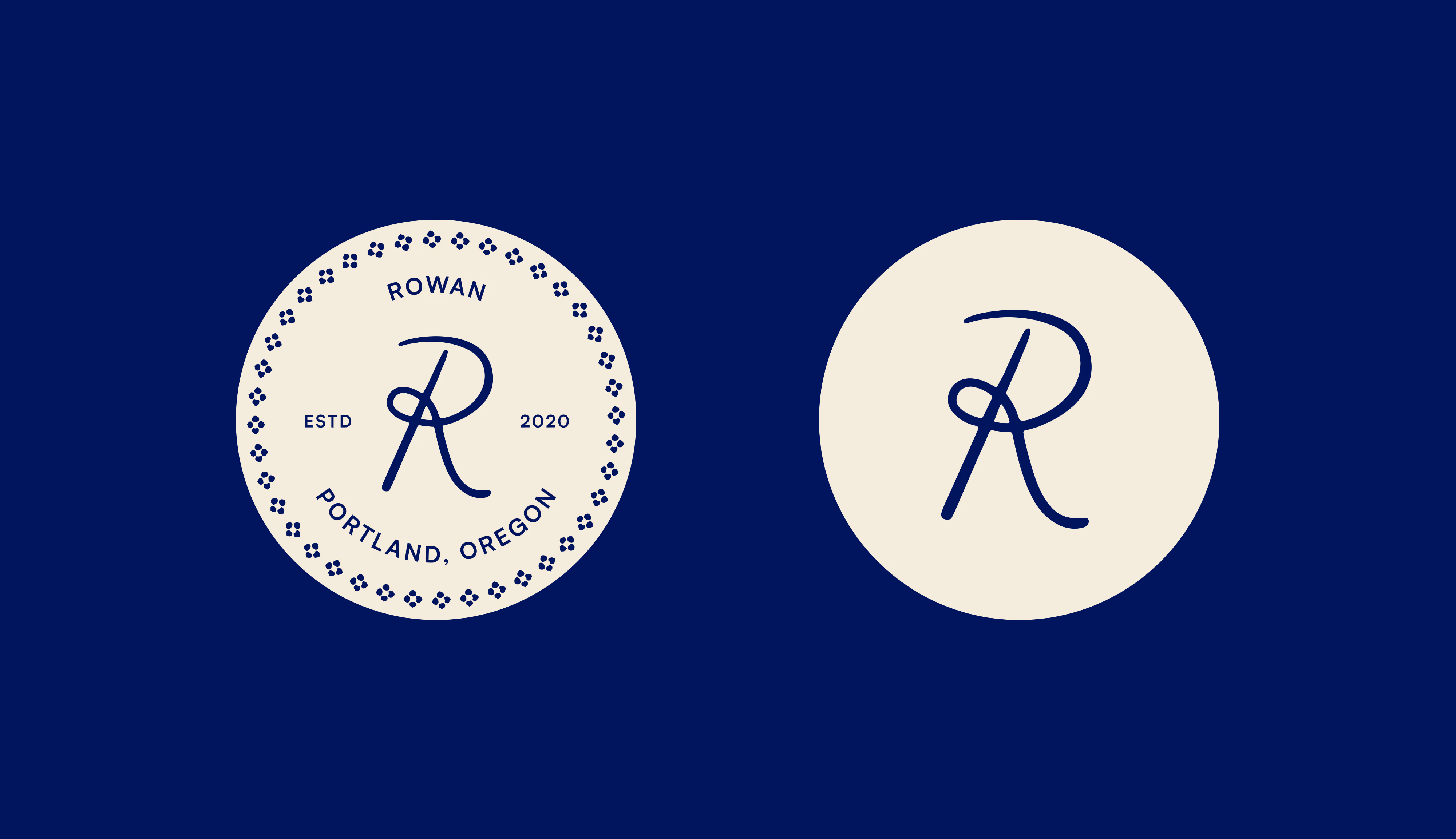
The primary logo was inspired by the handwriting of Chef Spencer's grandmother, the person who first sparked his love of cooking. We landed on a handdrawn, relaxed script that feels elegant yet approachable.
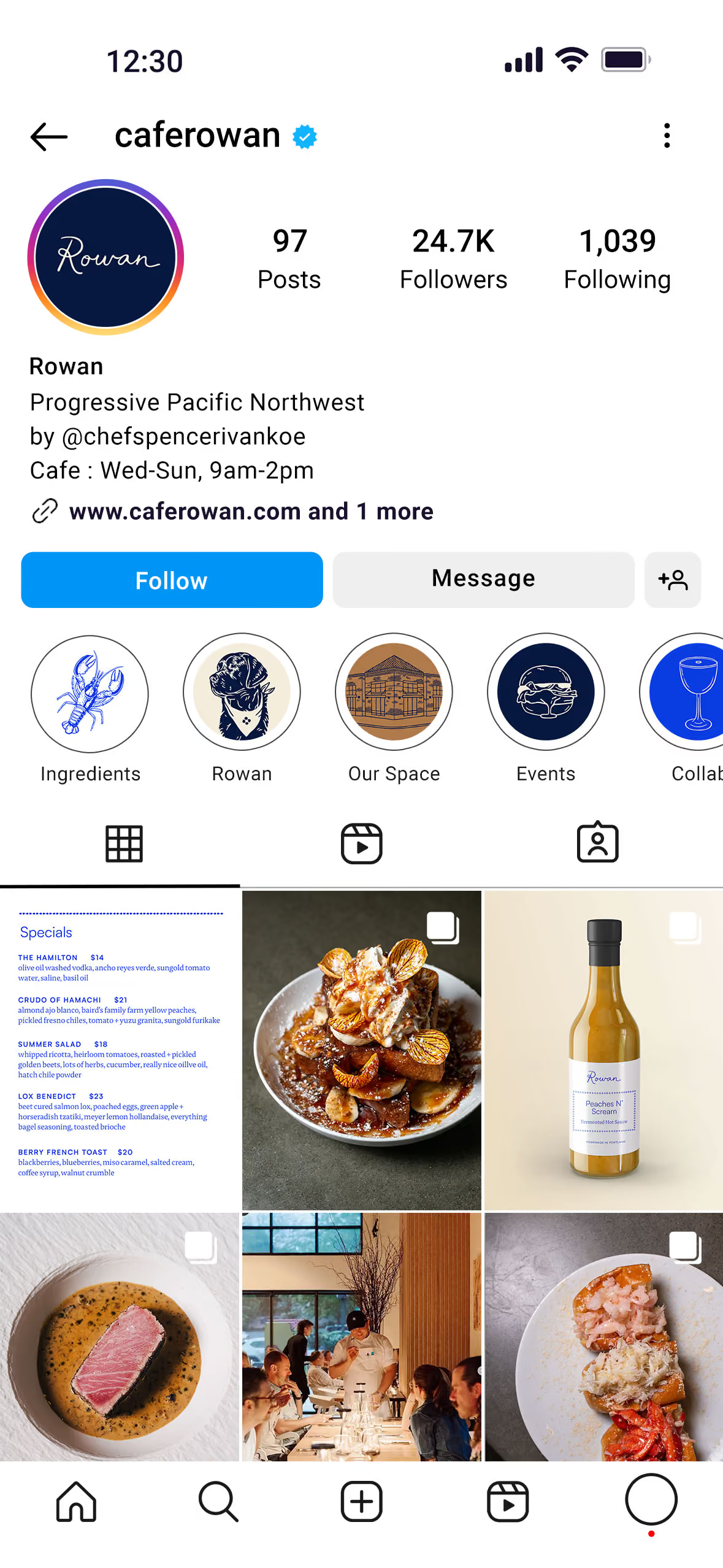
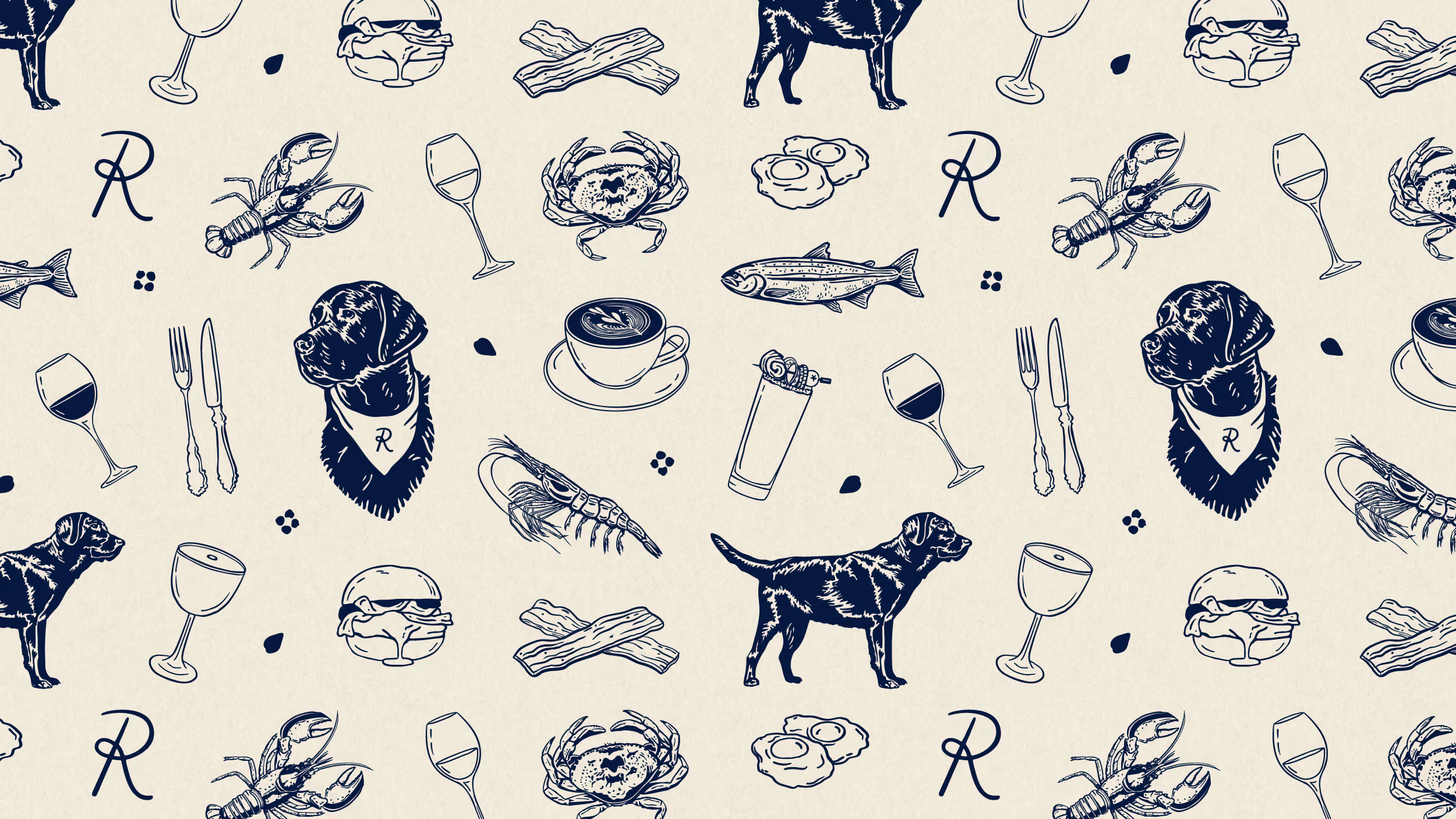
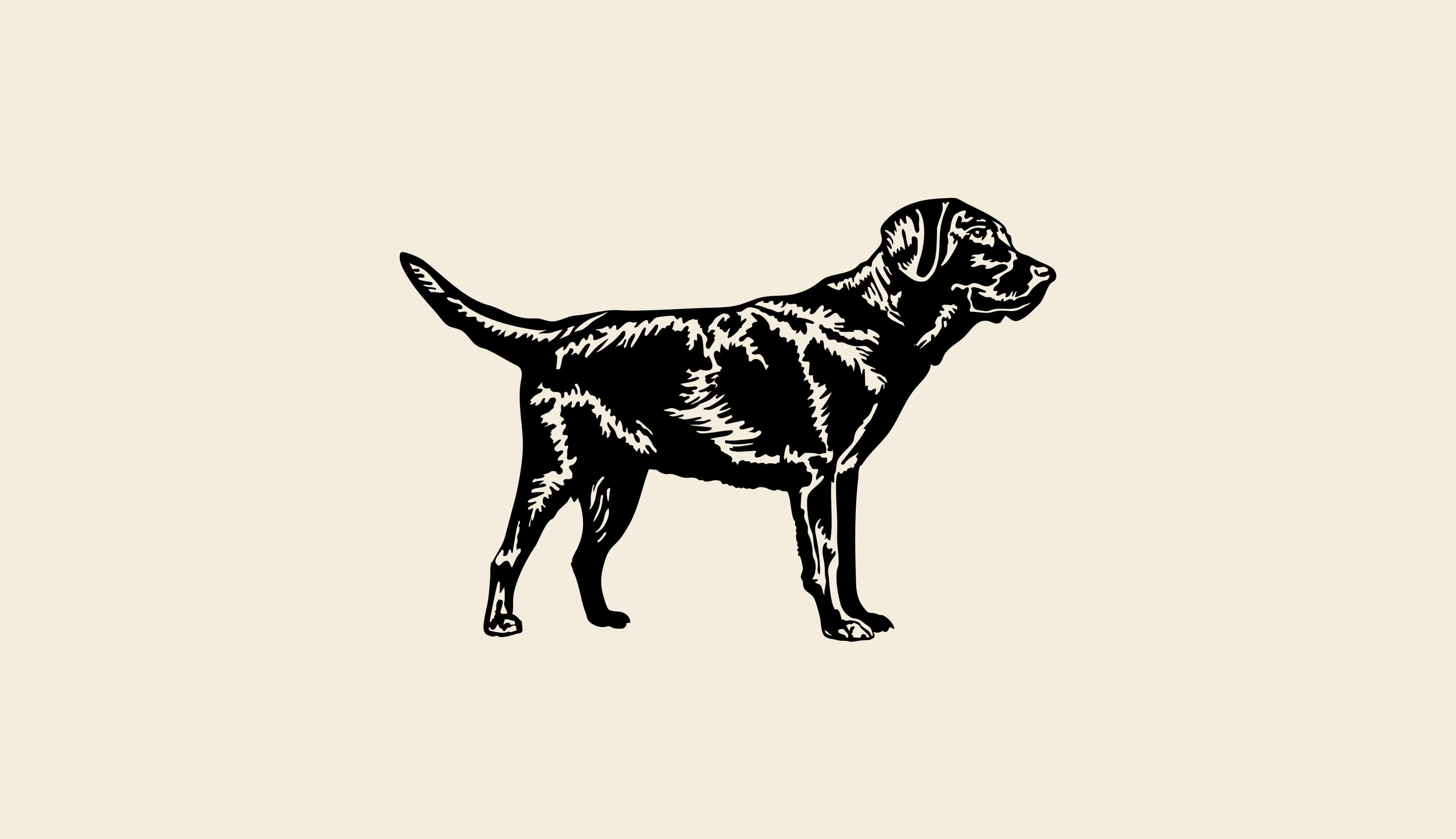
The restaurant’s previous logo featured a silhouette of their dog, Rowan, who gave the restaurant its name. While he is a beloved part of the brand, having a dog in the primary logo caused confusion and it was often mistaken for a pet store or vet. The dog illustrations still have a place in the brand as secondary elements, while the primary logo takes on a more refined, mature feel that suits this new chapter.
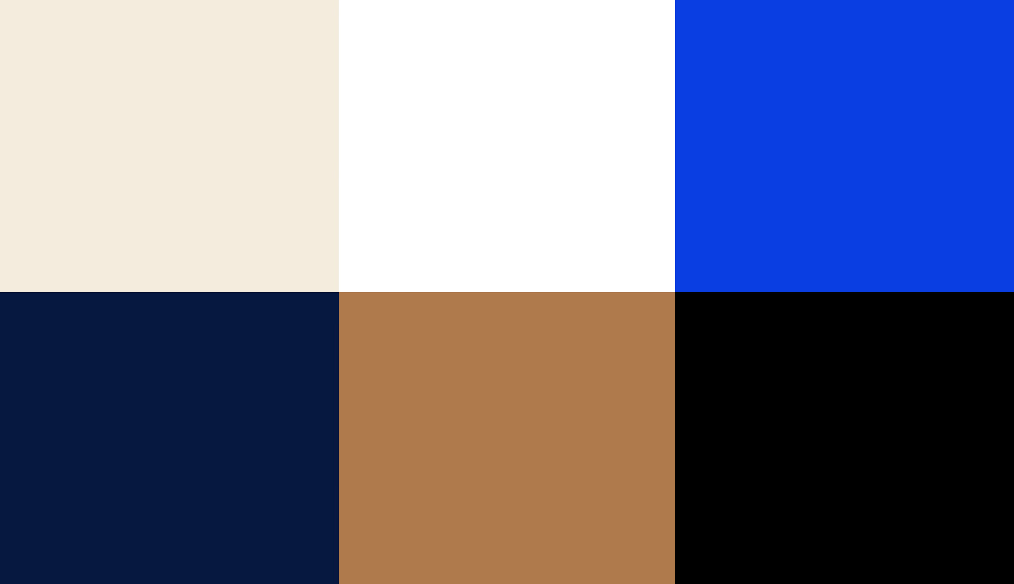
The brand colors blend warm neutrals like cream and caramel, nodding to the restaurant’s signature Bananas Foster French Toast. Deeper shades of navy and black add sophistication while a vibrant pop of cobalt blue evokes the sea, reflecting the seafood-focused menu.
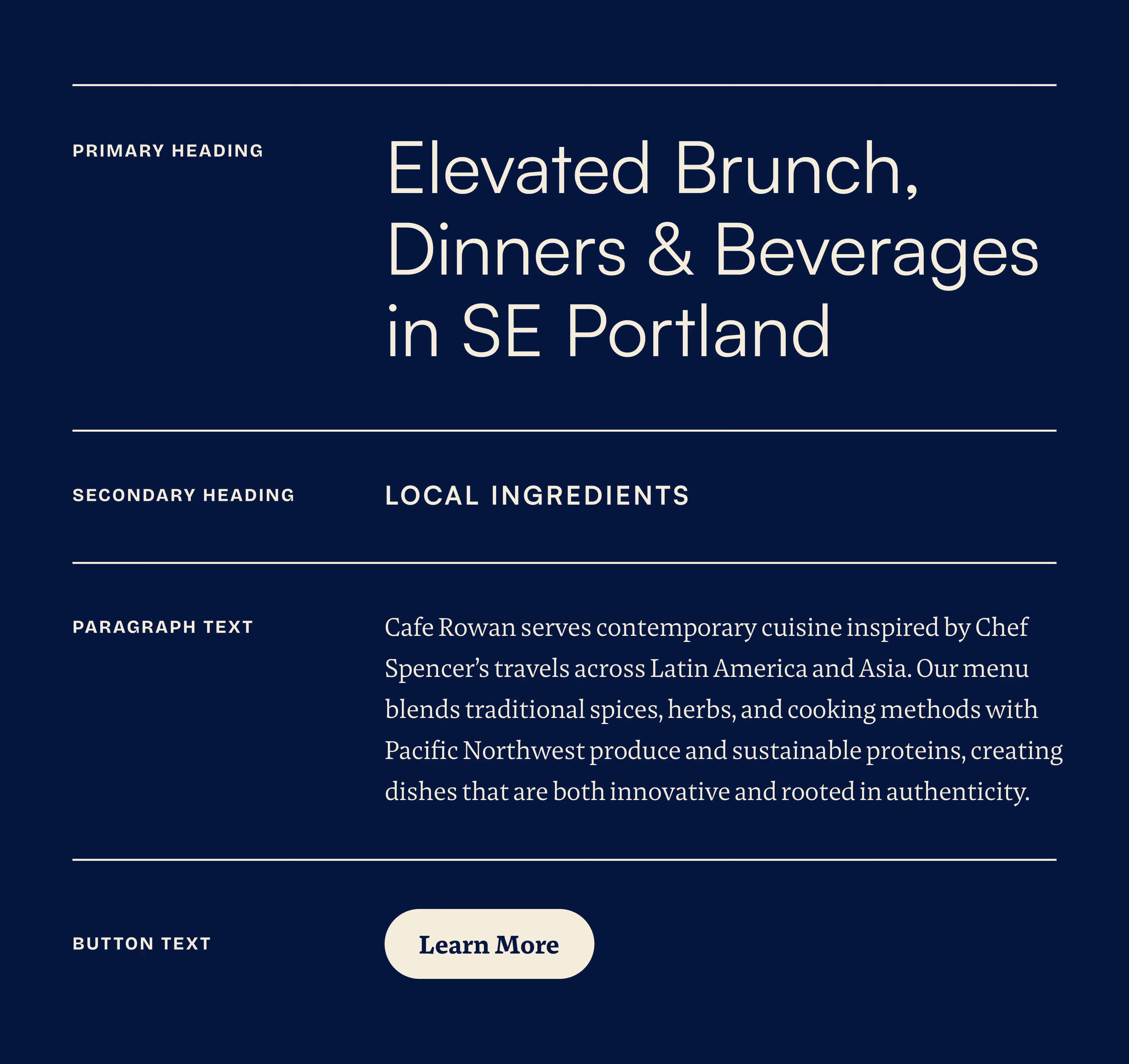
To balance the hand-drawn nature of the primary logo, a clean, sans serif font was selected for headings. It brings a modern, clean, and confident feel, while a legible serif for body text keeps menus easy to read.
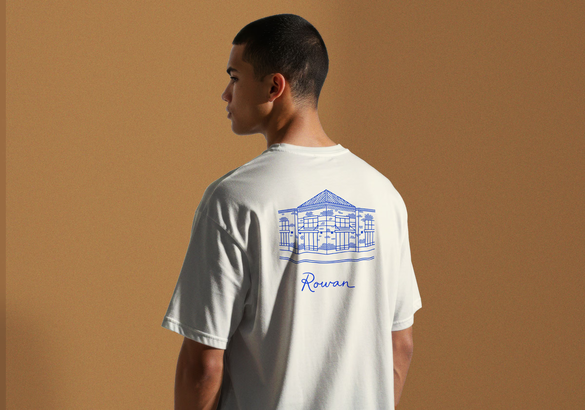
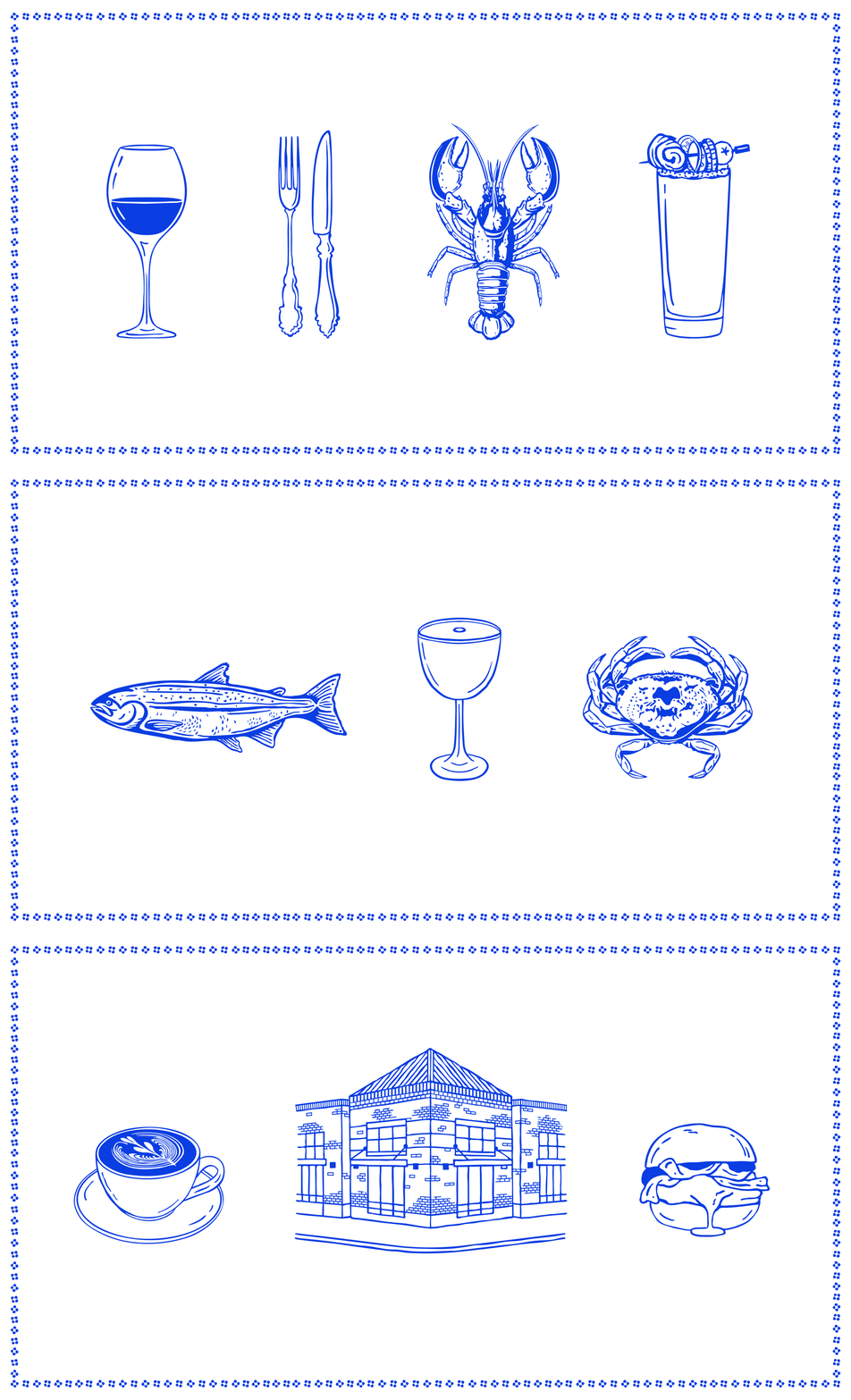
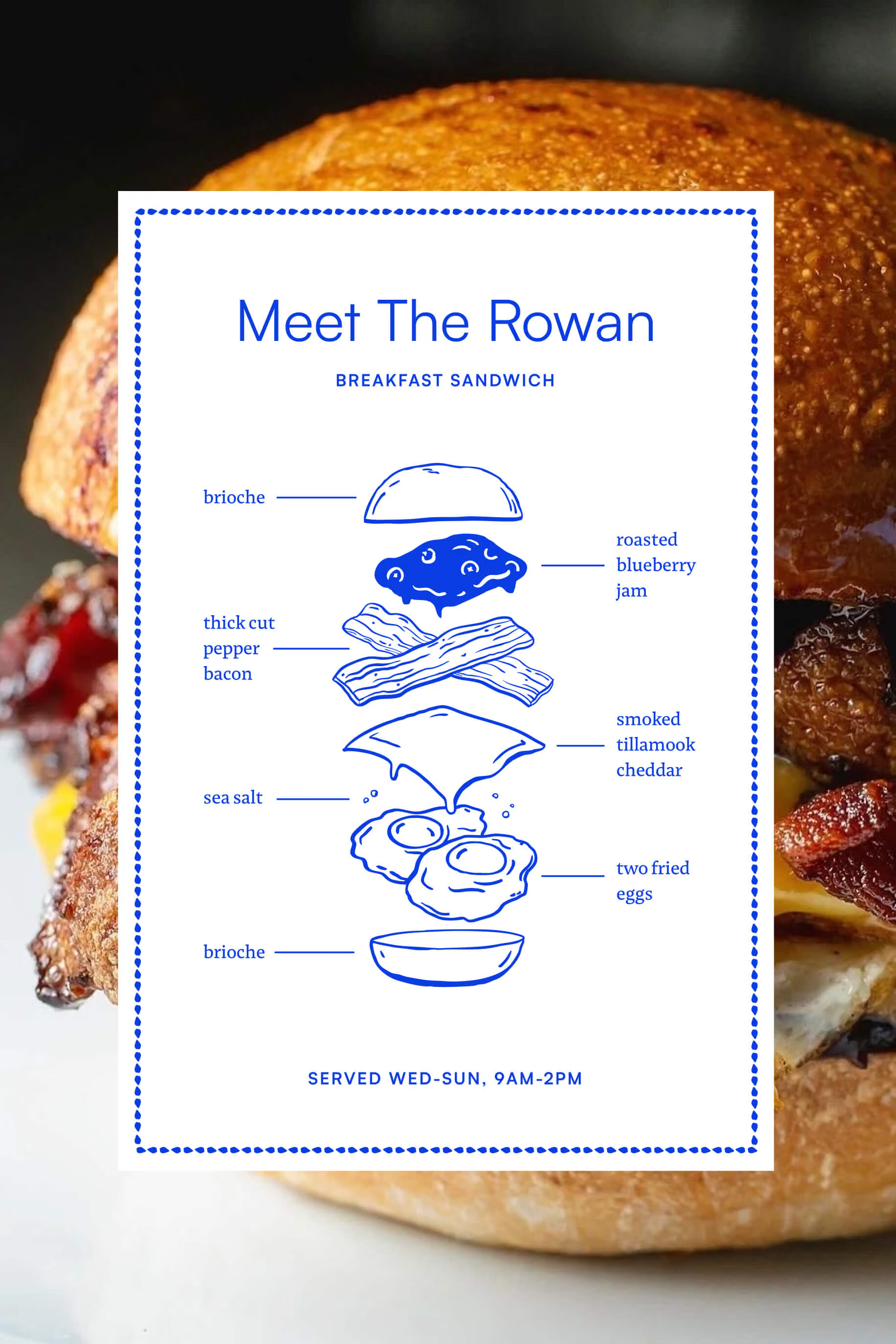
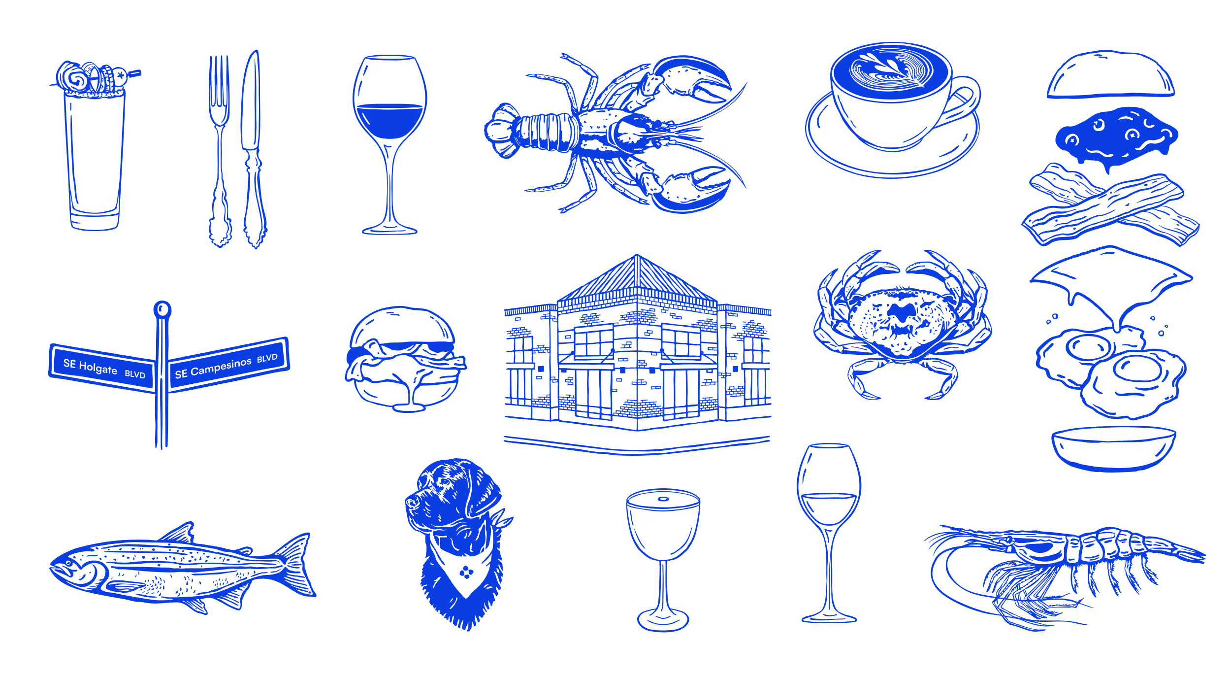
A custom set of illustrations adds a playful layer to the brand. Drawn by hand in a loose, outlined style, each piece has an organic, slightly whimsical charm. Rooted in the restaurant’s menu and dining experience, the set works across menus, signage, and social media, giving the brand a flexible visual language beyond the logo.
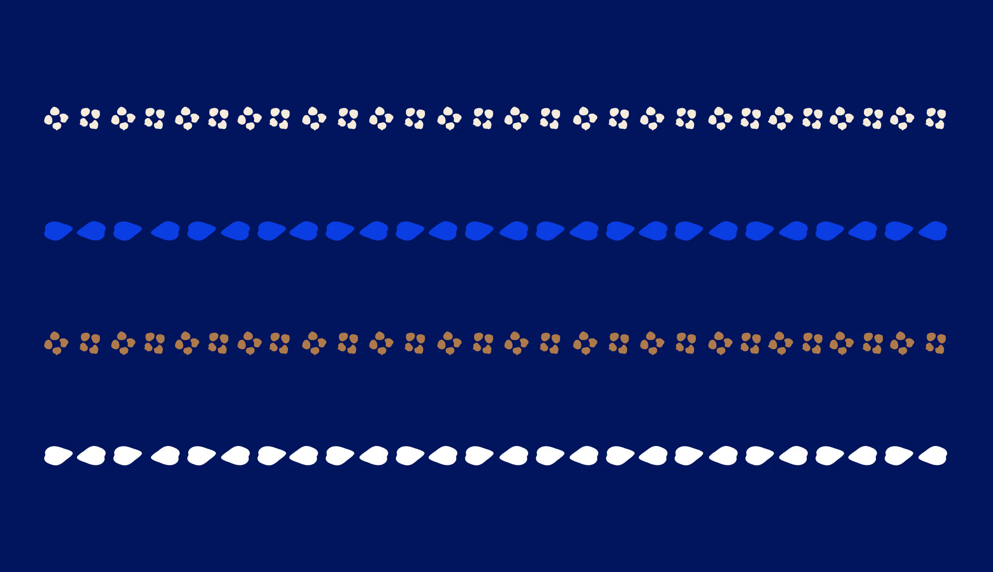
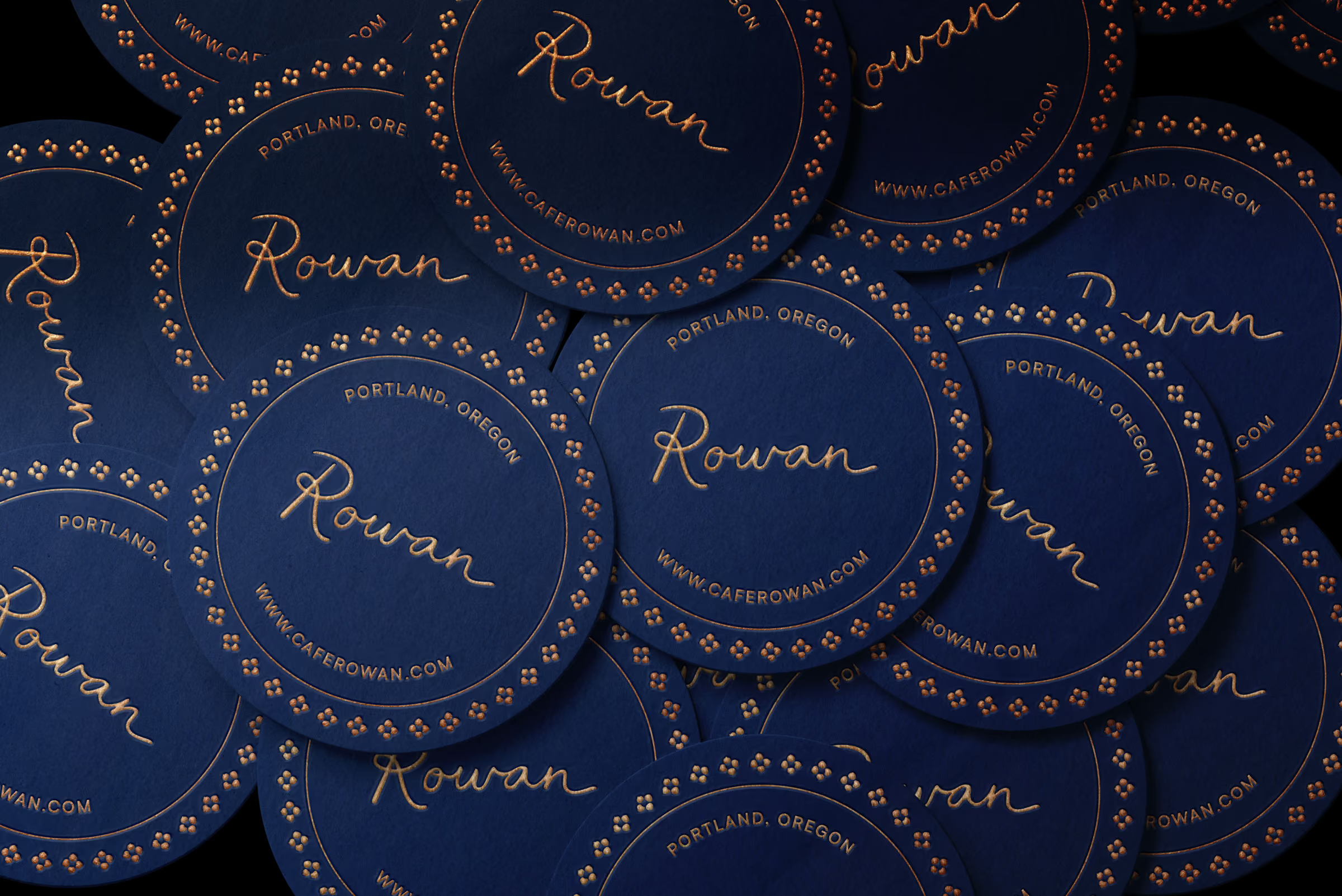
Drawn from the flowers and leaves used to garnish the restaurant’s dishes, these small motifs can be used independently or repeat to form lines, dividers, and borders across menus, signage, and print materials. These additional elements bring texture and rhythm to the brand's visual language while staying true to its hand-drawn character.