

Farmhouse Culture makes organic, probiotic-rich superfoods rooted in the tradition of fermentation. This project involved modernizing the brand identity and developing a cohesive, scalable packaging system designed to stand out both on shelf and online. The goal was to create a fresh, vibrant, and approachable brand that would resonate with a younger wellness consumer while retaining subtle connections to Farmhouse Culture’s heritage. A bold color palette, confident typography, and flexible visual system bring energy and personality to the line while creating clear differentiation across SKUs and room for future growth.
Simple
Bold
Clean
Approachable
Fun
Established
Organic
Brand Design
Illustration
Packaging Design


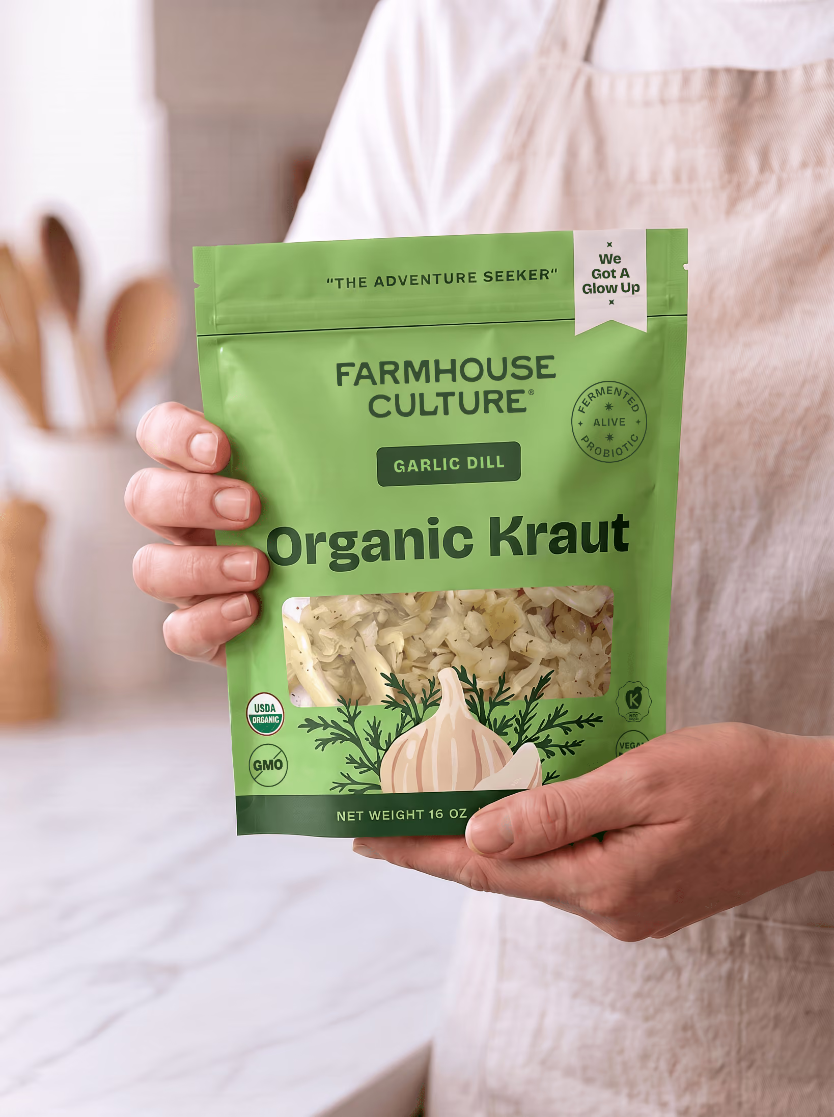
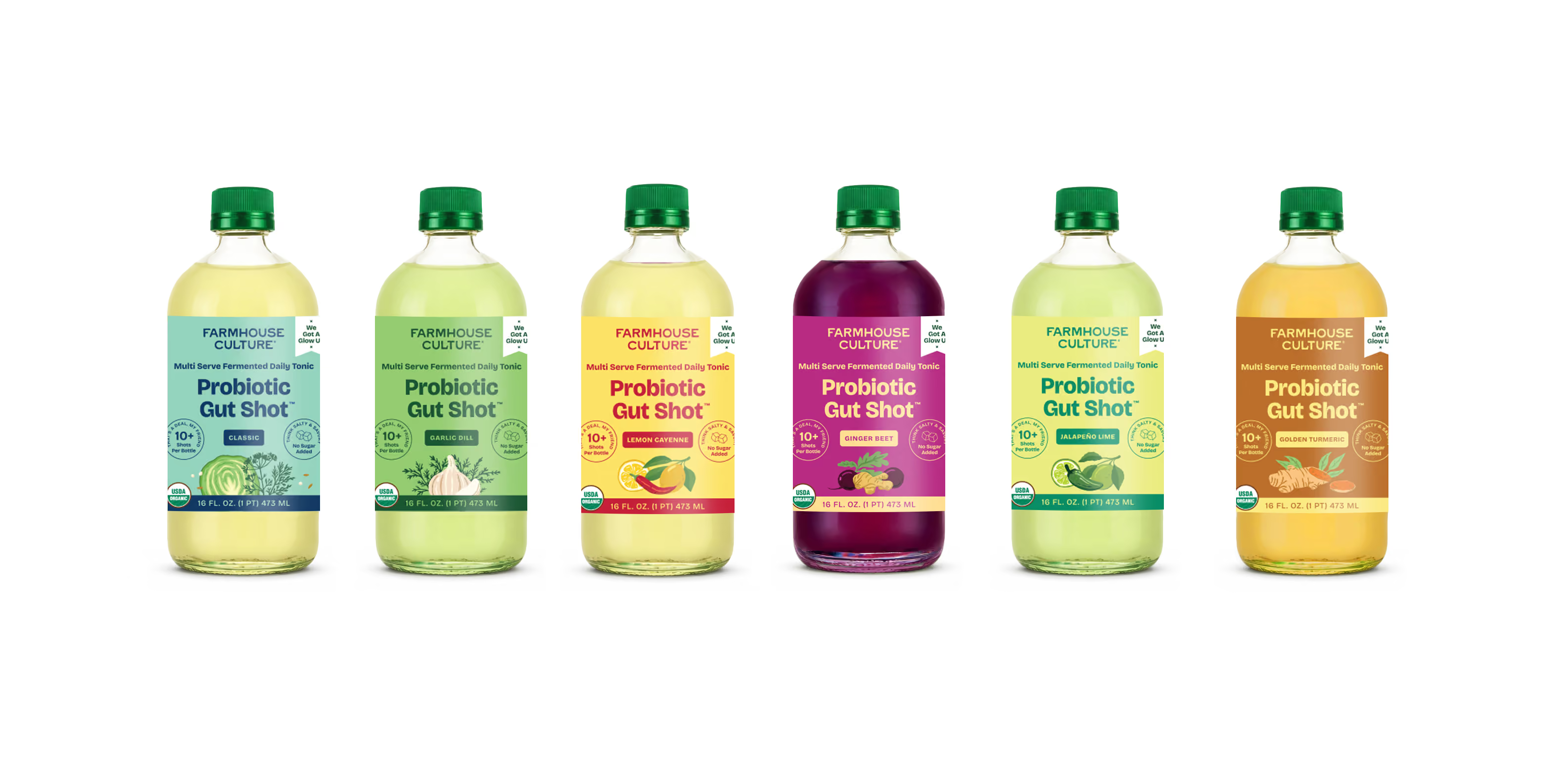

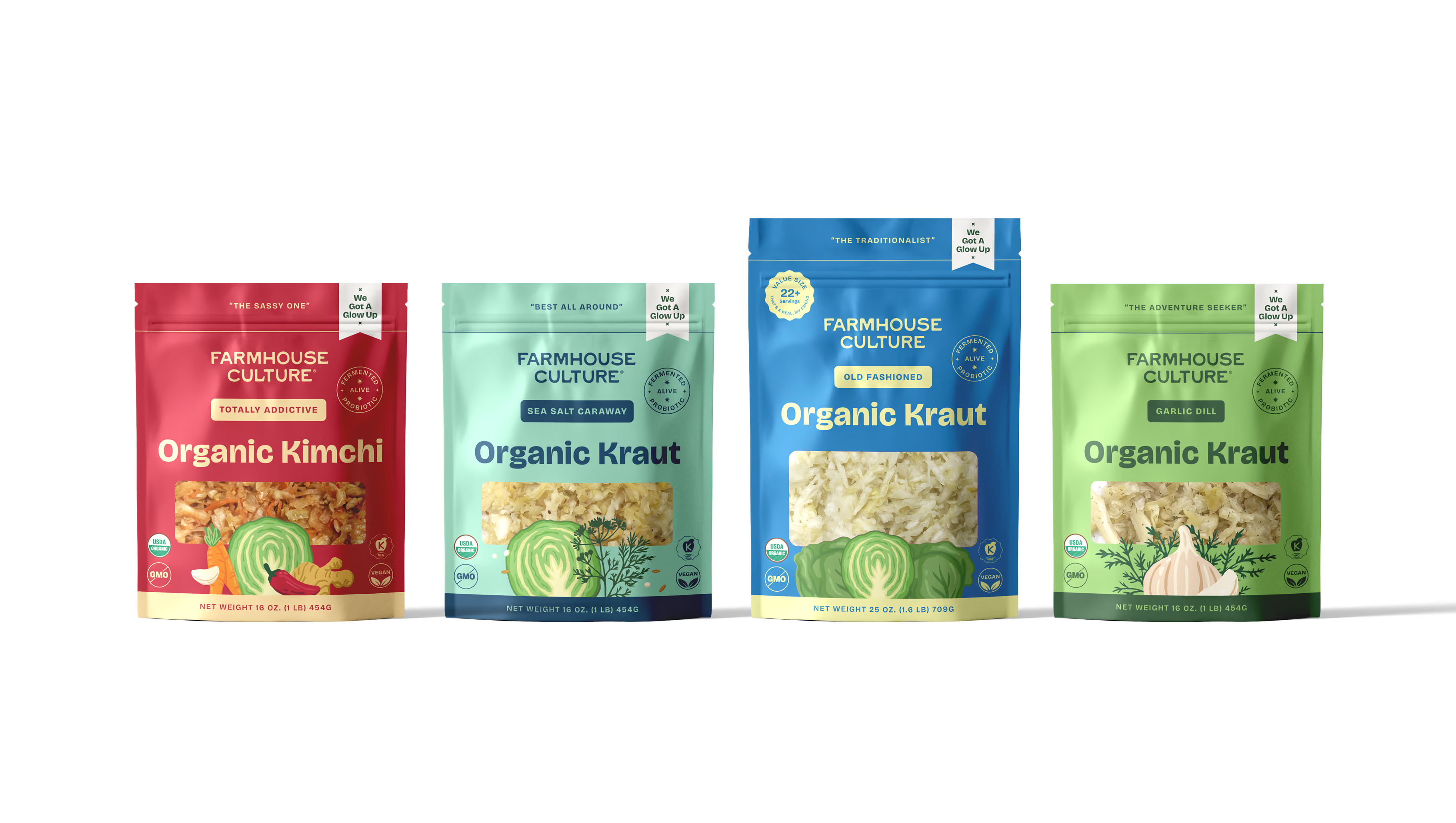


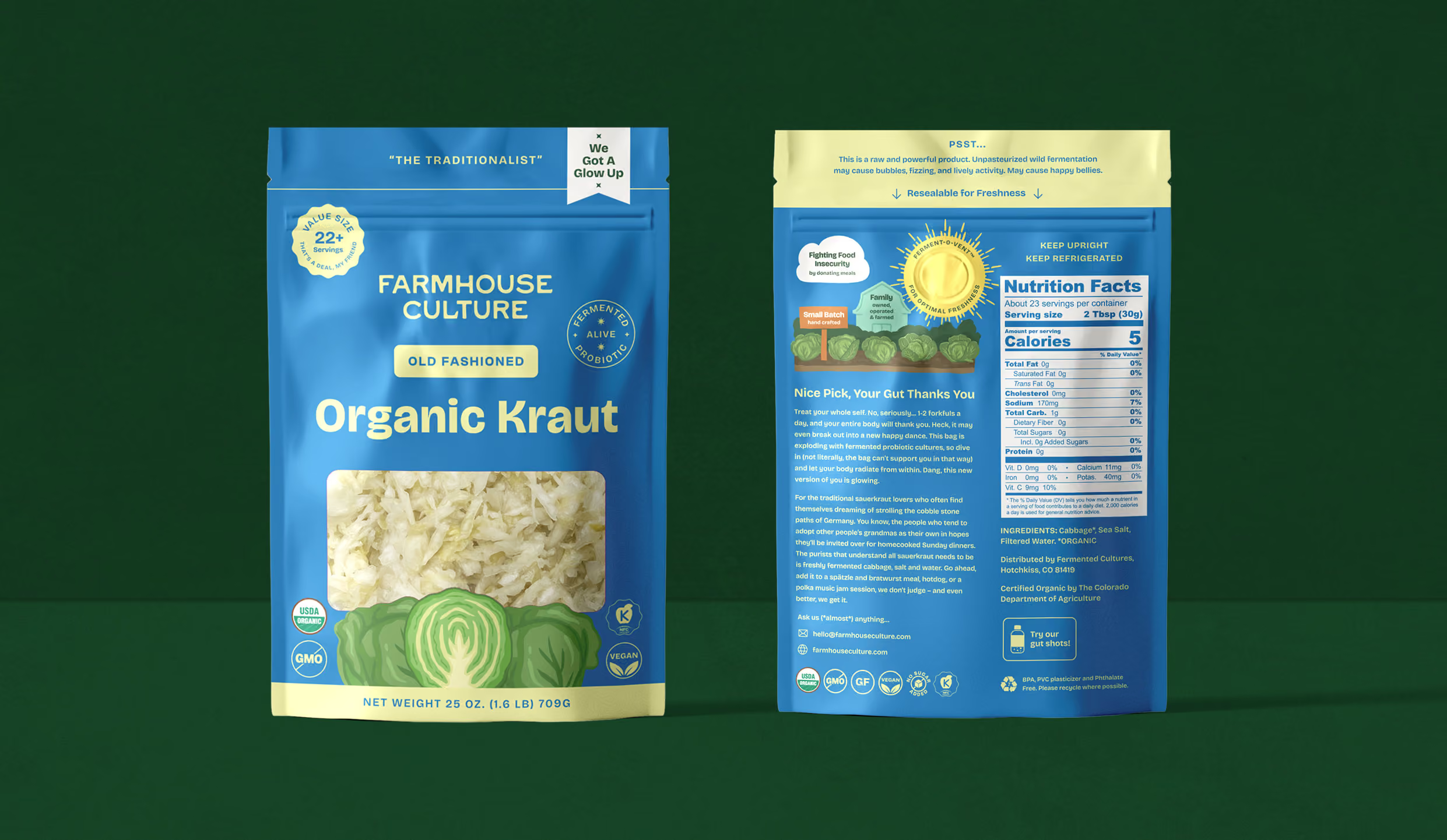
The Farmhouse Culture logo features a wide, all caps font with some playful customizations and subtle texture. The result is a simple mark that feels bold and established yet imperfect and organic.


The vibrant and fun color palette balances bright pops of color (green, yellow, and purple) with more natural, earthy hues (cream and turmeric). The more neutral colors add a organic and traditional feel while the other colors feel fresh, bold, and playful. The colors are pulled from the ingredients used across products such as lemon, turmeric, cabbage, kale, sea salt, and beet.

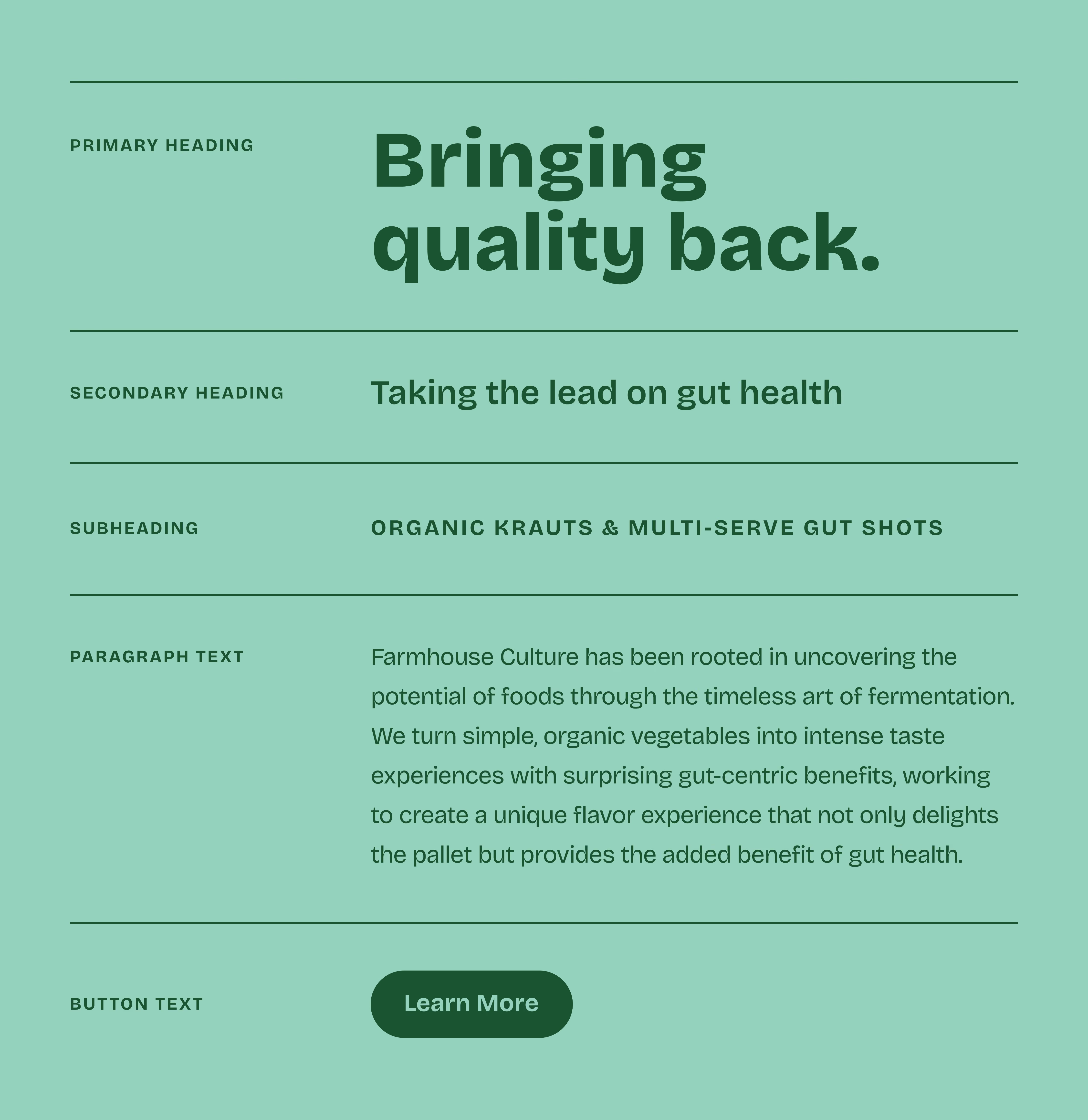
Farmhouse Culture's typography system is made up of a serif font that is modern, clean, and playful. It feels relaxed yet confident. Primary headings are set in a heavy weight to add boldness and ensure legibility on packaging.
“Mariel was a dream to work with! She really listened to my vision and created something I could have never put together into words. She was fast, efficient and very communicative. I would totally recommend her to anyone looking to update, or overhaul, their graphics! 10 out of 10 would recommend!”
