Maua makes healthy, protein-packed popsicles that taste like a treat. This project involved developing a full brand identity for Maua, including logo design, color palette, typography system, custom illustration, and initial packaging concepts. The goal was to create a brand that felt as good as the product itself: clean and natural, but bold and quirky enough to stand out in a crowded market.
Clean
Modern
Colorful
Quirky
Playful
Elegant
Confident
Brand Design
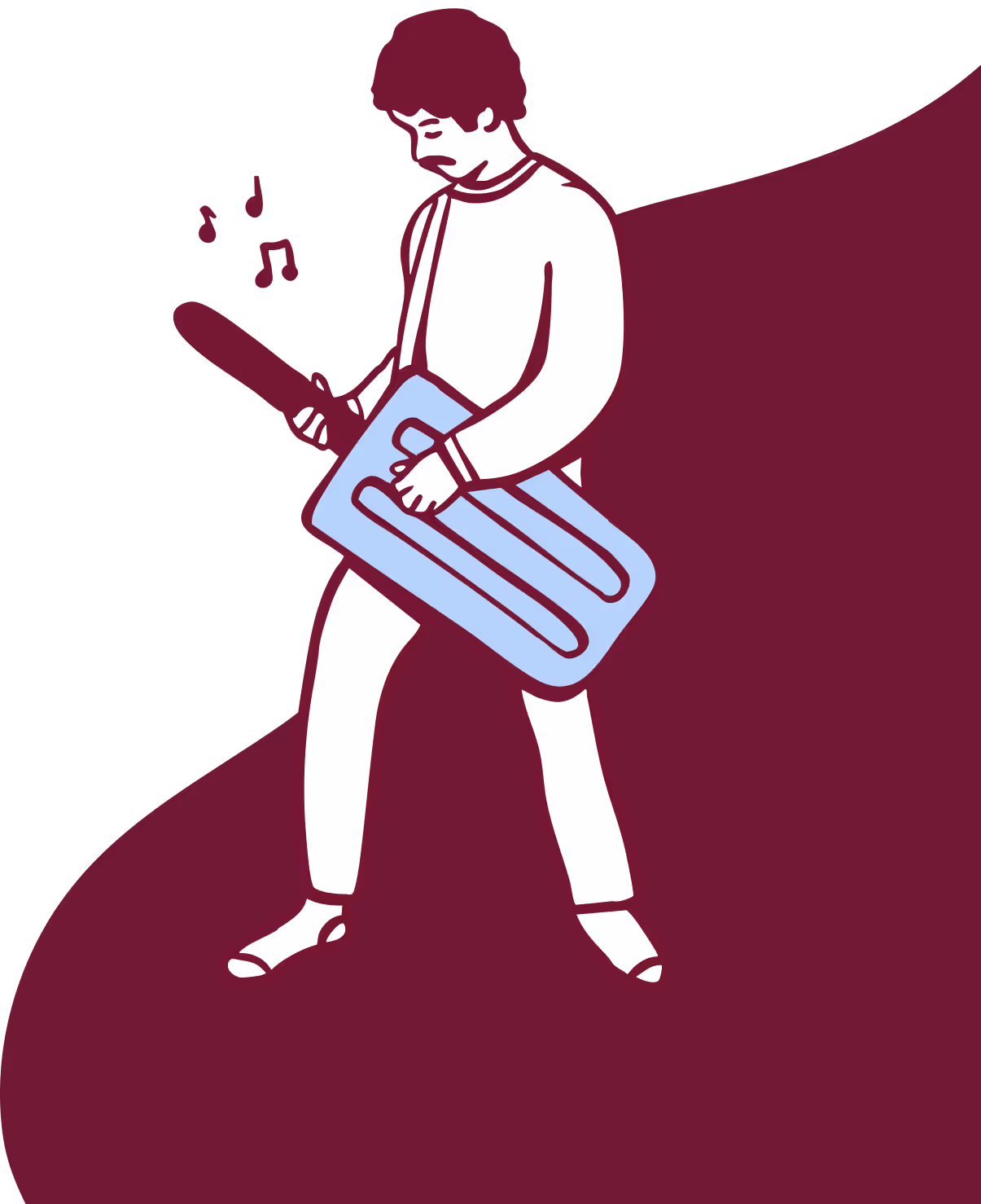
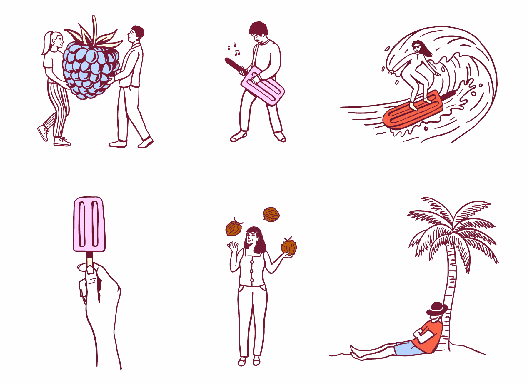
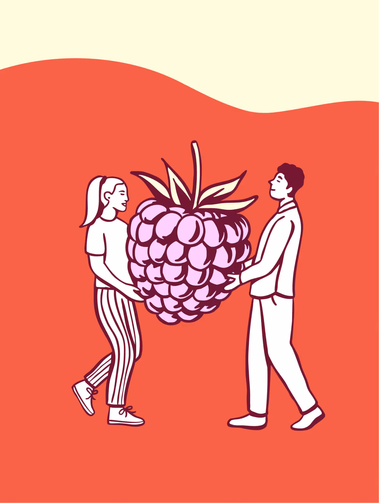
Illustration
Packaging Ideation


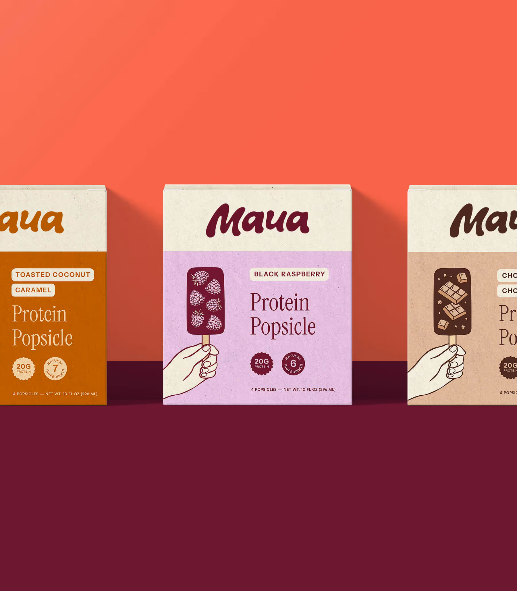

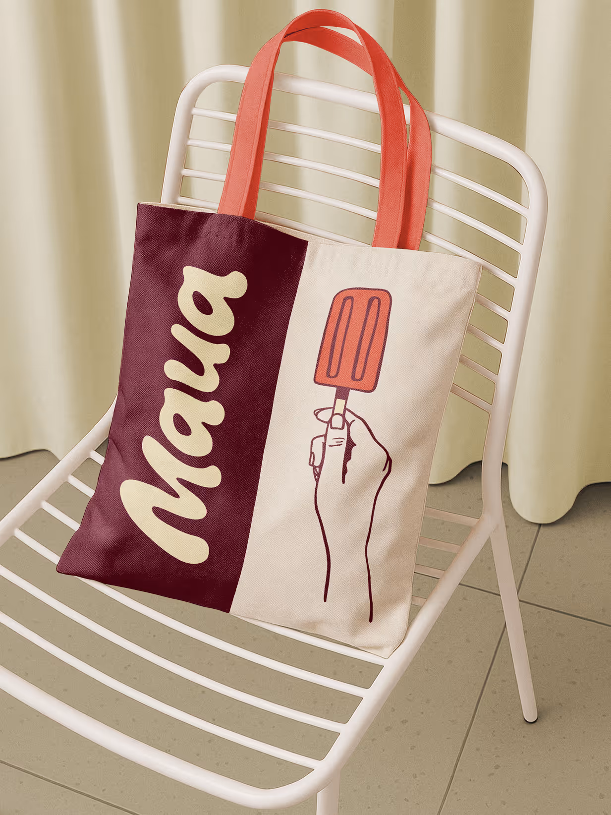
Maua's logotype is bold, rounded, and full of character. Inspired by the melting nature of a popsicle, it feels as fun and refreshing as the product itself. The hand-crafted lettering strikes a balance between quirky and natural, giving the brand a warm, approachable personality that still feels confident and polished.
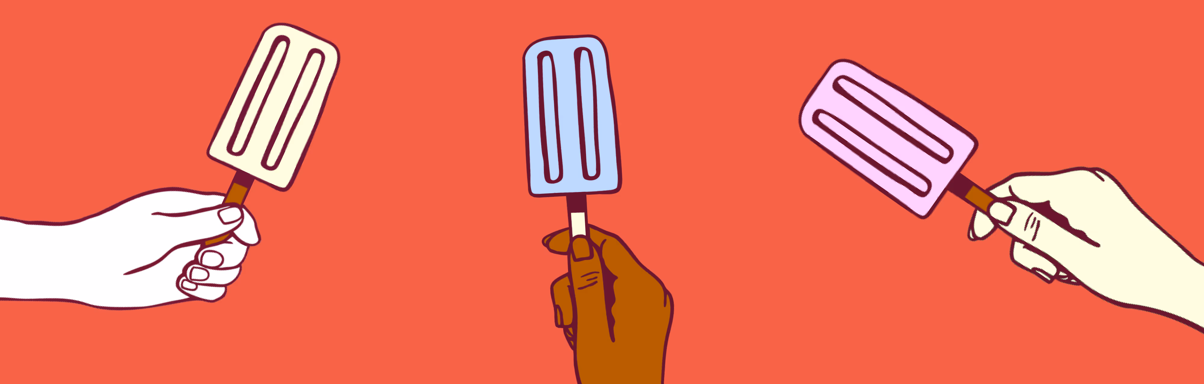
The palette is inspired by the richness of real ingredients and bold flavors. The primary palette of a warm cream, crisp white, deep raspberry, and vibrant persimmon feels elegant and modern. Secondary tones of caramel, pink lavender, and blueberry add to the playful, yet natural feel of the brand. The result is a confident, distinctive palette that sets Maua apart on the shelf.

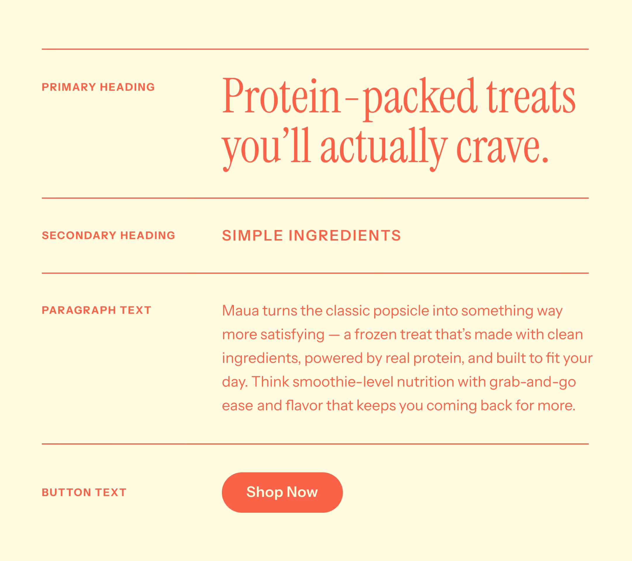
Maua's typography system is made up of two typefaces that work together to reflect the brand's personality. The primary heading typeface is a classic serif, bringing an elegant, editorial quality to the brand that feels premium and confident. Body text is set in a simple, readable sans-serif that feels approachable and unpretentious, mirroring the brand's commitment to clean, straightforward ingredients.
“Everything from the call ins, to the very transparent pay structure, to super on point and beautiful work, I cannot recommend her enough. Mariel seems to be a master in translating your ideas and vision into a masterpiece. Every time I provided feedback it was beautifully integrated the next time a revision round was due. I have already gotten so many compliments and asks on who did the creative work for my company.”
