Ormega is a forward-thinking, natural performance apparel brand that re-engineers activewear with 100% natural materials. They offer plastic-free, plant-dyed activewear that protects your skin, your health, and the planet. Their clean, responsibly-made activewear is designed for those who care as much about what goes on their body as much as what goes in it.
Natural
Active
Earthy
Sleek
Innovative
Clean
Confident
Brand Design
Email Design
Created in partnership with Salazar Studio
Creative Direction: Anastasia Salazar
Messaging: Juhee Lee
Web Design: Laura Brisson
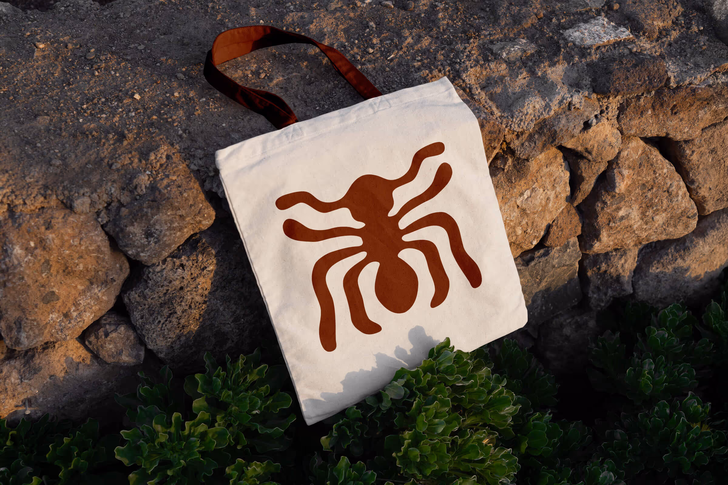

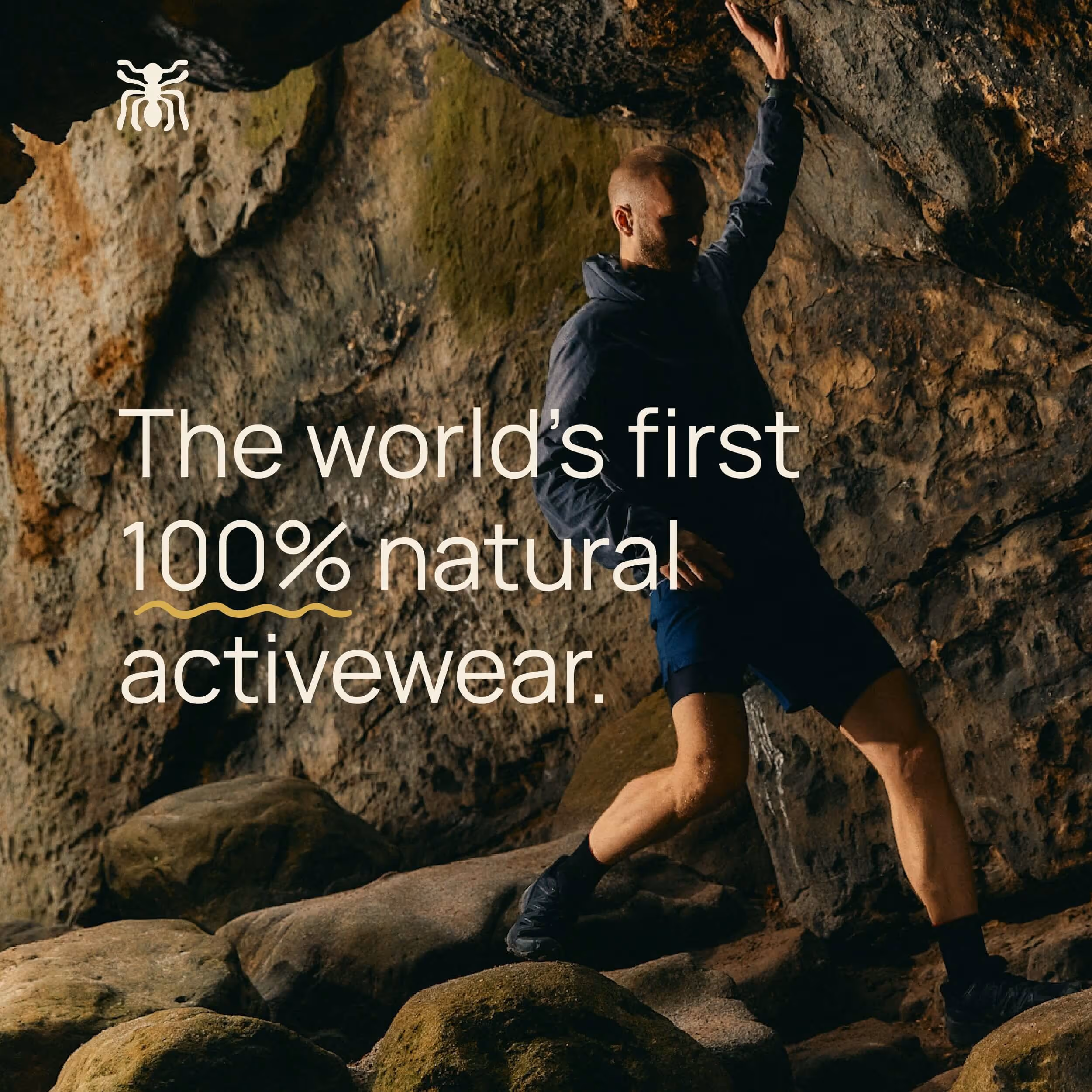
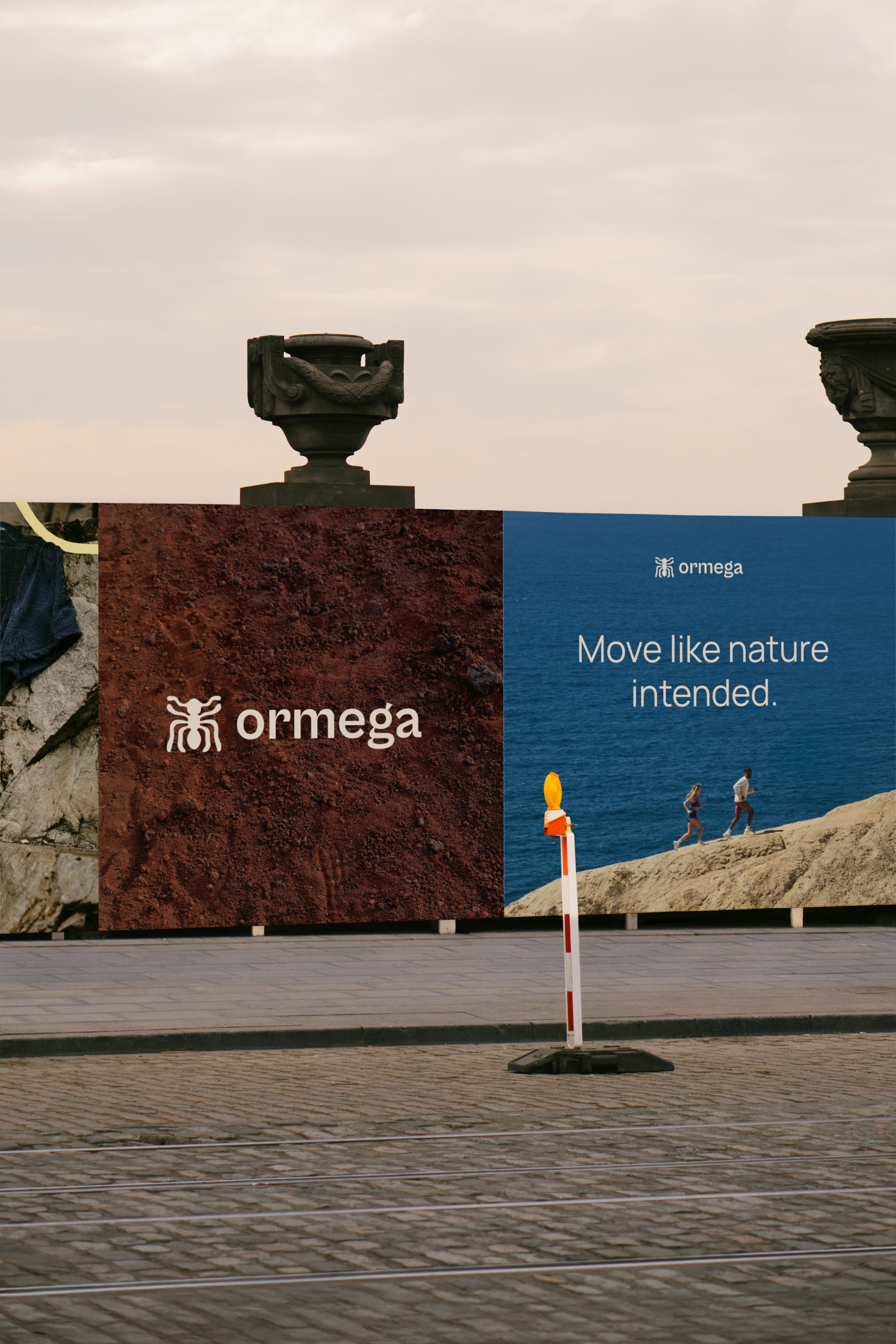


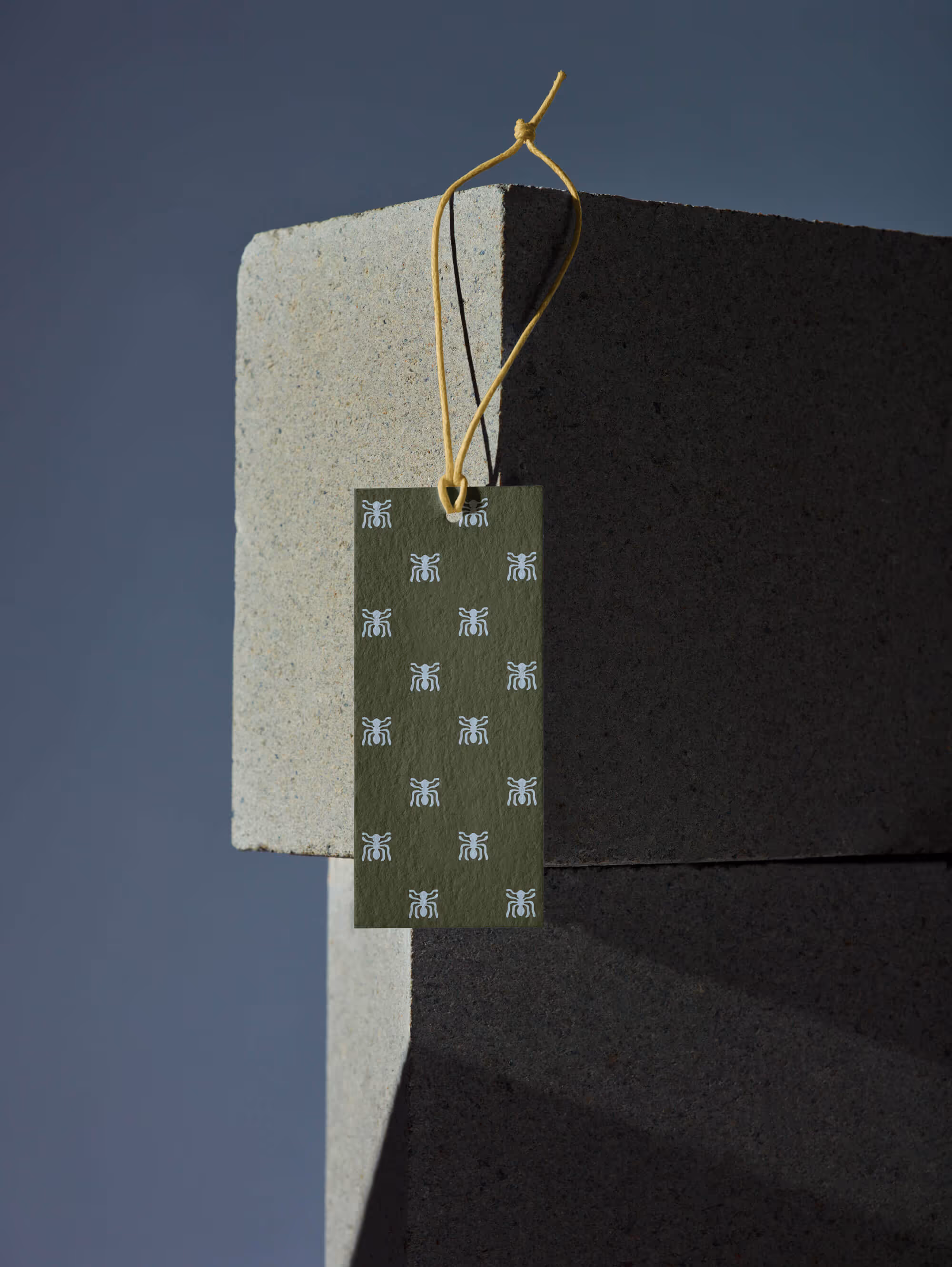
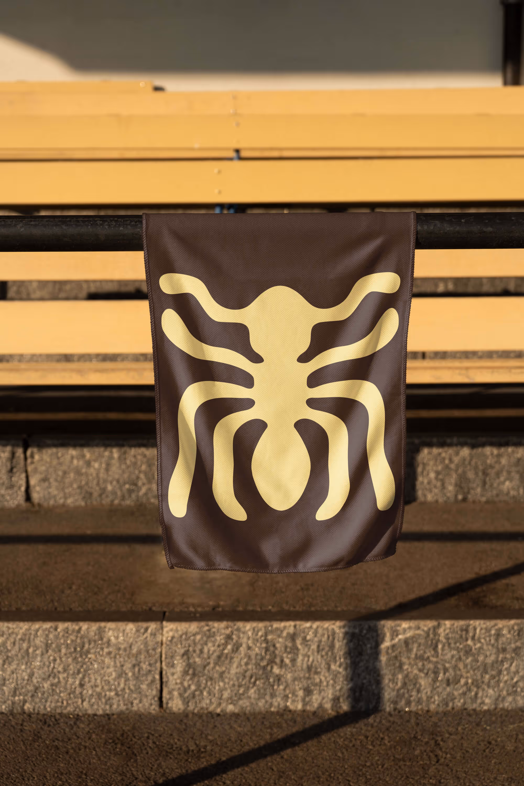


Inspired by the Spanish word for “ant,” the Ormega name reflects the idea that small, deliberate actions can lead to powerful impact. This concept guided the logo design, which nods to the ant’s form through organic lines, influenced by the Nazca Lines of Peru. Paired with a modern, clean typeface, the logo feels grounded and natural while projecting quiet confidence.
The Ormega color palette is designed to feel natural and earthy while maintaining a modern edge. Colors are drawn from the natural dye process itself, resulting in a diverse yet cohesive range of warm hues that feel organic, inviting, and visually balanced. The varied tones provide flexibility and contrast across applications.

Ormega’s typography pairs modern simplicity with a sense of strength and purpose. Clean lines and sturdy letterforms create a system that feels confident and functional, supporting the brand’s organic influences while maintaining a contemporary edge.