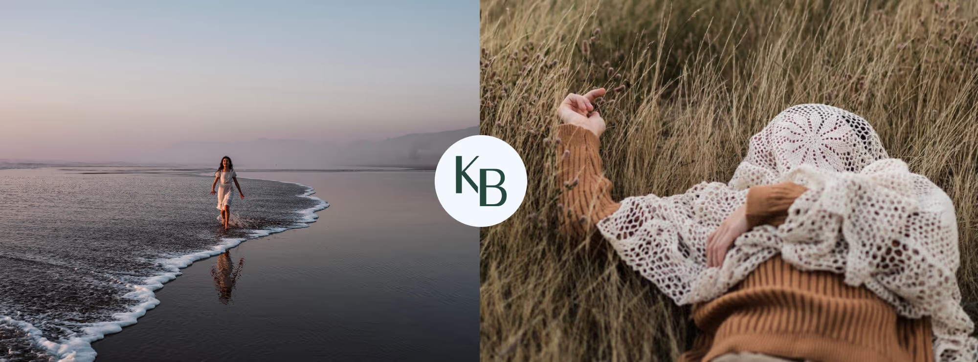
Brand and web design for a Portland-based photographer capturing people’s stories and life’s beautiful moments through her lens.
Clean
Colorful
Approachable
Spontaneous
Authentic
Brand Design
Web Design

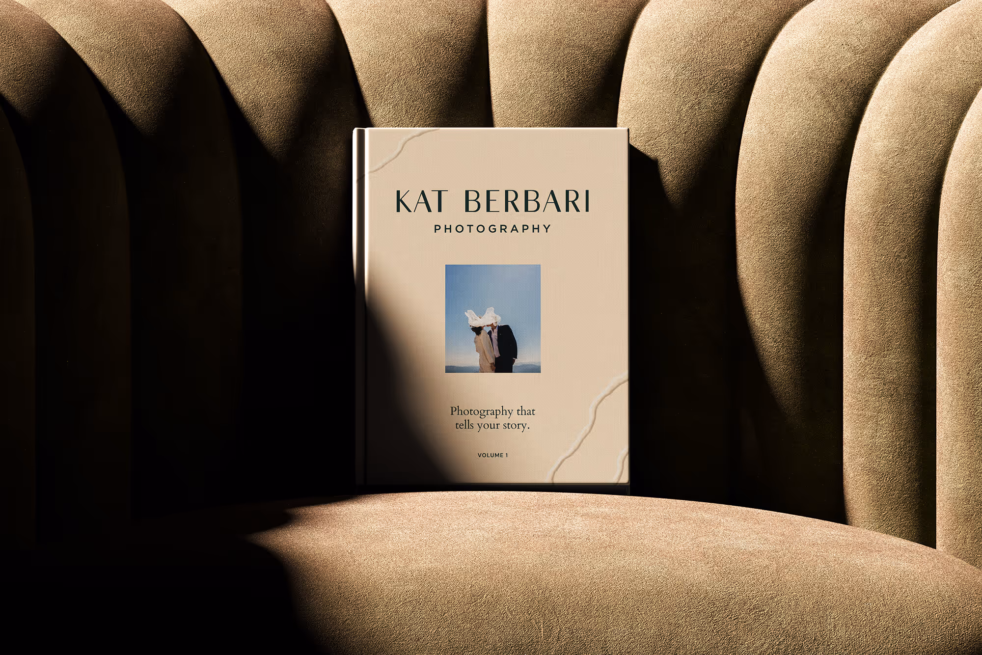
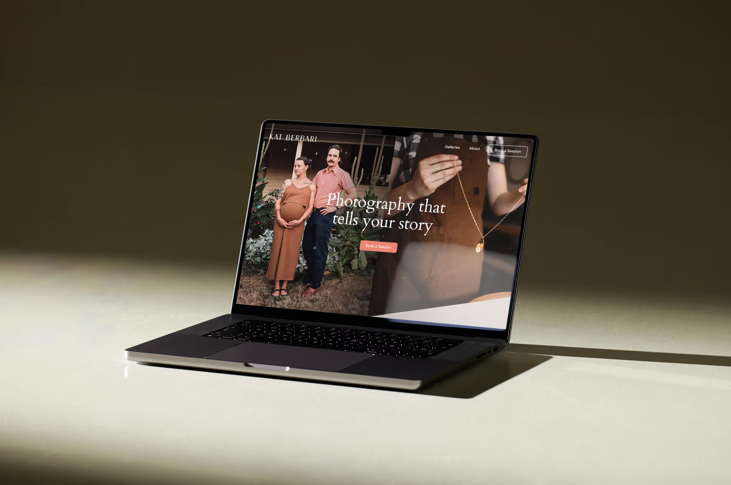
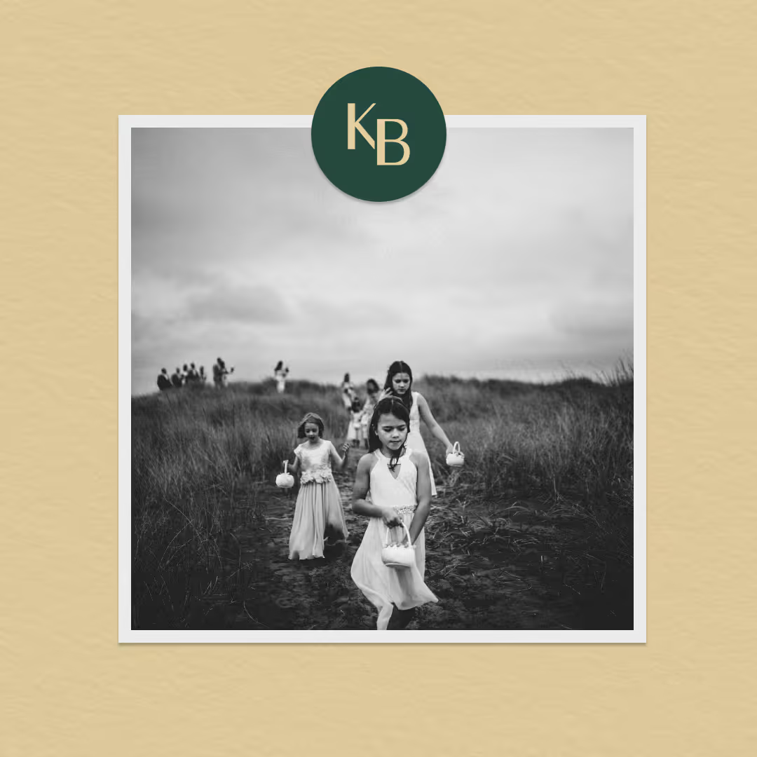
Clean, simple typography create a timeless, modern mark that feels both refined and approachable. Delicate yet confident, the design reflects a thoughtful, editorial aesthetic that lets Kat's photography take center stage.
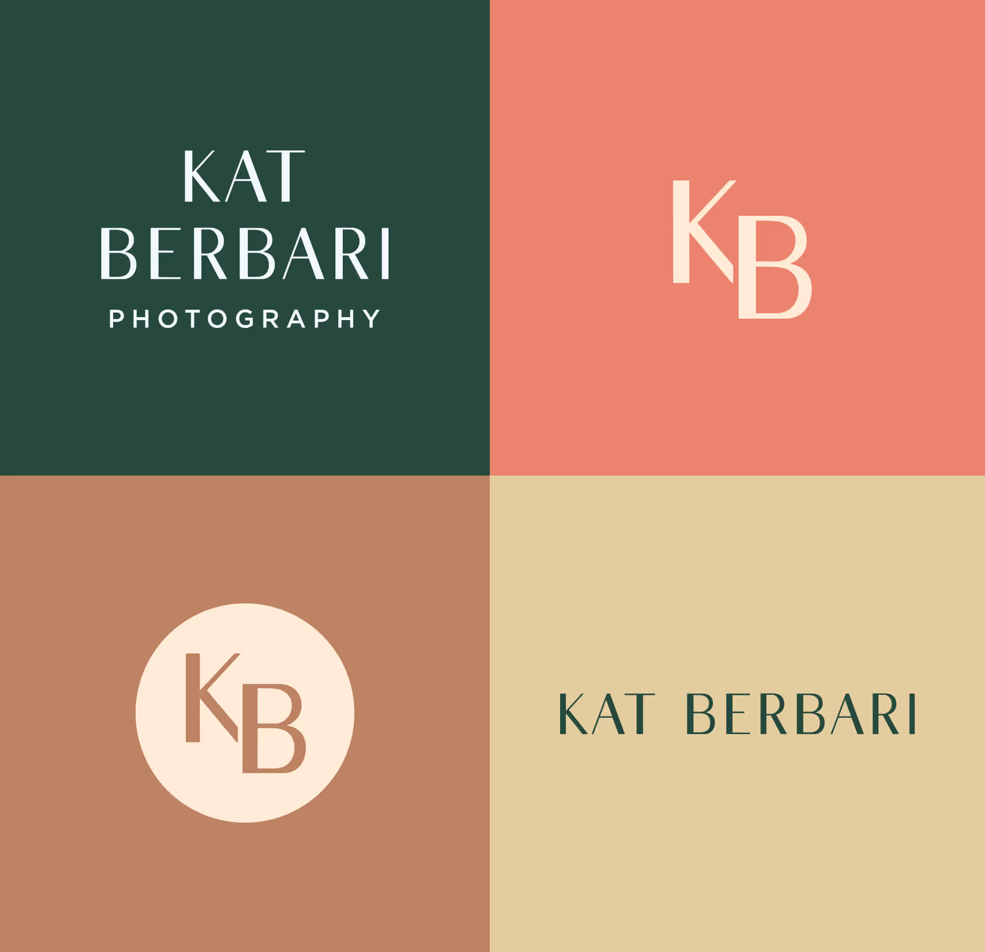
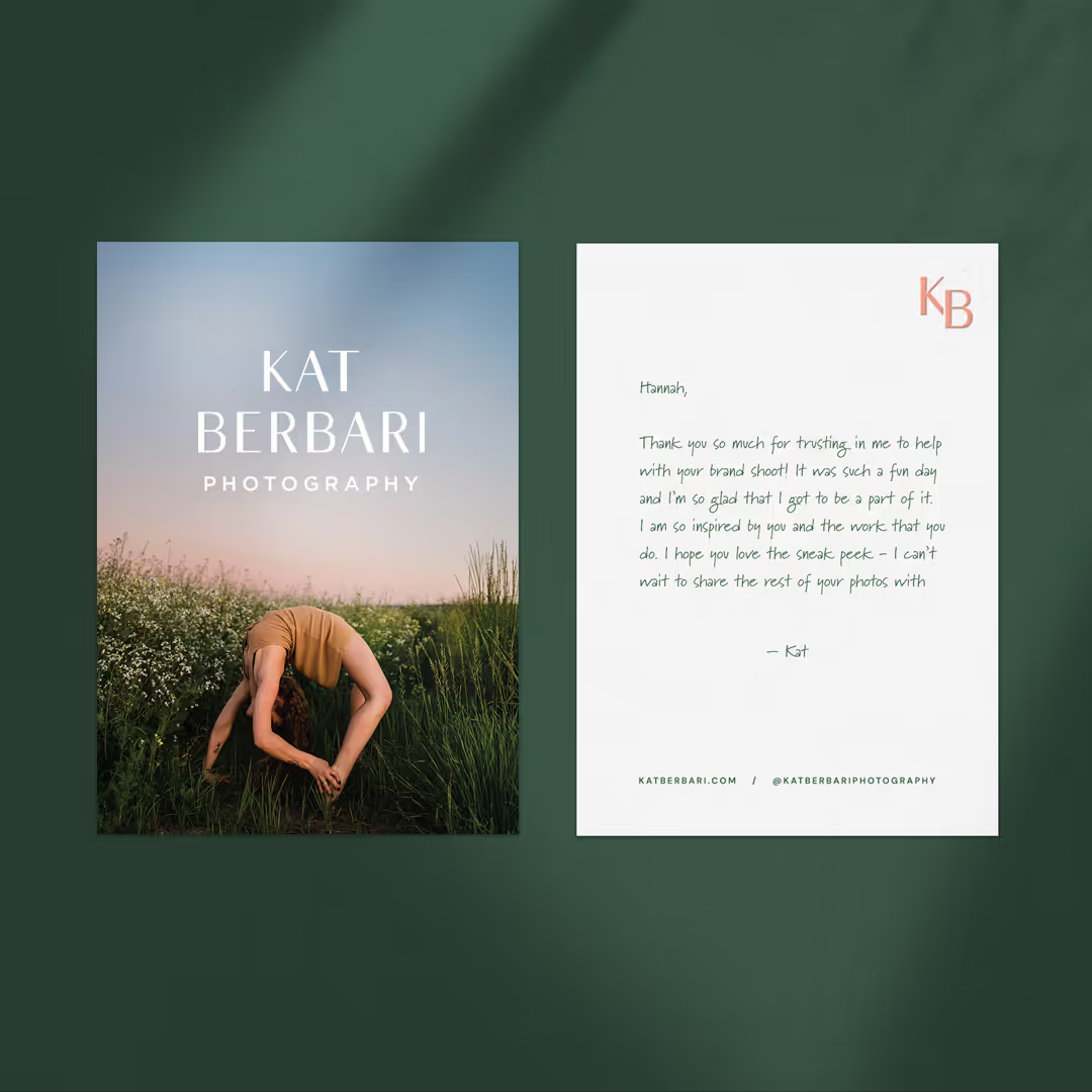
The color palette is inspired by the earthy tones found naturally in photography. Deep green, soft blue, terracotta, and gentle neutrals evoke a sense of warmth, balance, and authenticity. Brighter terracotta is used sparingly as an accent, adding subtle contrast without overpowering the imagery. Intentionally understated, the palette allows images to breathe while adding depth and cohesion to the brand, creating a grounded, timeless foundation that feels organic, inviting, and effortlessly elegant.

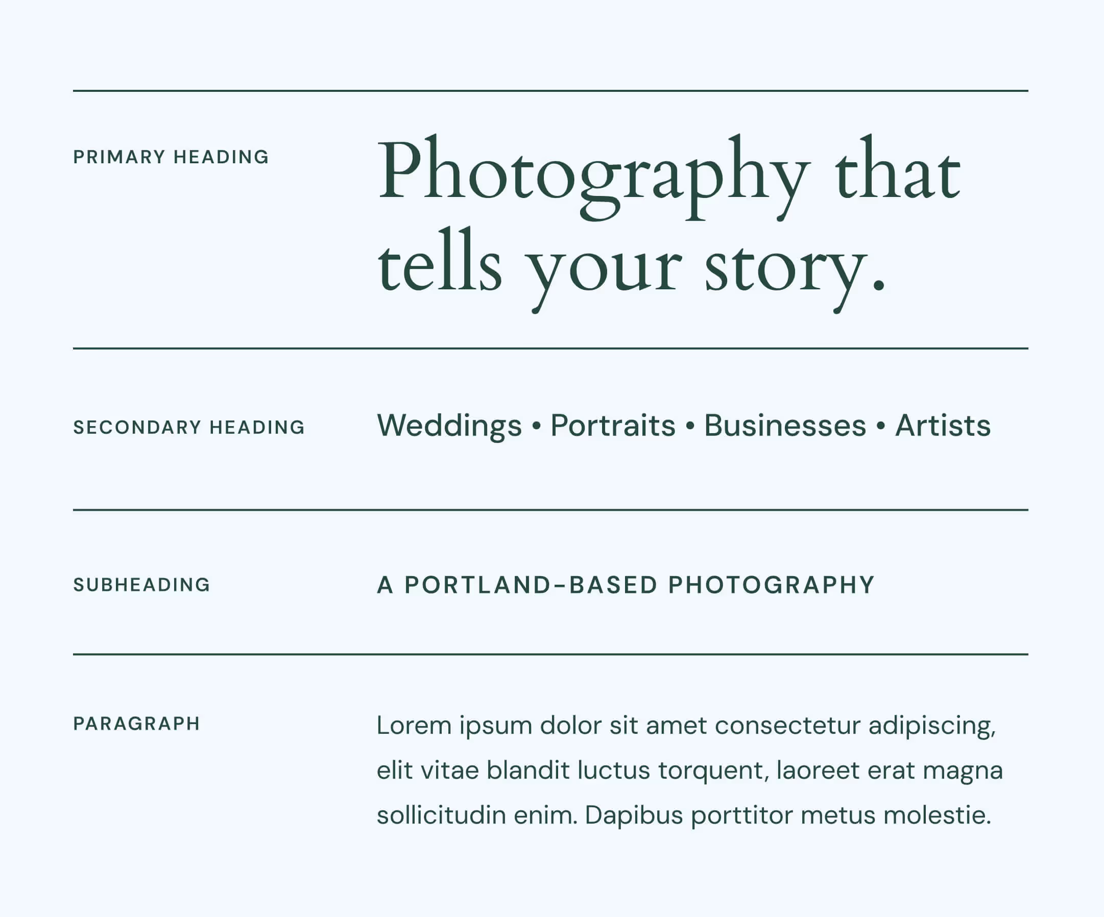
The typography was thoughtfully chosen to feel timeless, elegant, and quietly expressive. A refined serif brings a sense of warmth and artistry to primary headings, while clean, understated supporting text adds balance and clarity. Together, the type system reflects a modern editorial style that feels polished yet approachable.
“Mariel is highly skilled at her many professional abilities. She is a great communicator and works hard to meet the goals and visions of her clients. Mariel helped me elevate my business by designing a new website and branding. Every time we met to discuss the evolution of the project she listened very closely and always delivered exactly what I was hoping for. I am so lucky to have her as my design expert and look forward to collaborating more with her in the future. I highly recommend hiring her! She’s a really lovely person and is so amazing at what she does.”
